 I hate Daniel Libeskind’s so-called museum. Esthetically it looks even worse than DenMT’s first entry, a building I compared unfavorably to a copper-clad rectangular turd. More to the point, it isn’t even a real museum – thus violating its brief -- rather it’s a monument to Libeskind’s own view of Jewish history.
It’s not a museum. Museums are archives; they store and exhibit historical artifacts, documents and such in a manner that allows the public to examine the real artifact (what historians term the primary source) directly. When you go to a museum, you are viewing history with your own eyes, free of much of the author’s bias and not limited by the photographer’s lens. The facts are there in front of you, undiluted, uncensored, and in 3-D ready for your cross-examination. In other words, the value of a well-curated museum, as opposed to a history book, is that the evidential basis for history is sitting right in front of you rather than simply being described to you, and the only bias you bring to your observations and deductions is your own.
If this is the purpose of a museum then the purpose of a museum-architect is to aid the punter to observe the artifact on display. His job is to give the punter enough light to observe the exhibit closely and enough space and tranquility to contemplate both the object’s meaning and the context in which it has been presented. People go to museums to become enlightened and they must be able to digest the exhibition at their own pace and in their own way, forming their own opinions independently of the curator and the crowd. Such are the key interior elements to be found in my favorite museums.
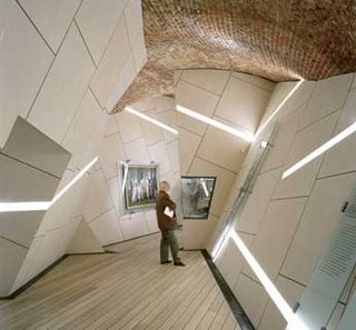
 Now let us observe Libeskind's so-called architectural masterpiece. Observe how claustrophobic some of the halls are; how the odd shaped walls and low roof closes in on the observer in the picture he supplied. This punter in the photo supplied has been forced – deliberately - to examine the exhibit from one distance and at one angle. Why? Well because Libeskind has decided to set the mood for the museum. German-Jewish history according to Libeskind is an unrelenting tragedy and the exhibition requires his artistic skills to convey this. DenMT explains: “Libeskind, through form and programme, recreates the history of the Jewish people in Germany. The straight line, broken into fragments can be conceived as the Jewish presence in Berlin and Germany, punctuated by voids, absences, and silence.”
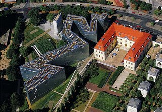
Make no mistake, the architect is unabashedly attempting to manipulate the punter’s interpretation of the exhibitions, forcing his opinions on the museum’s visitors. This is why some of this museum’s feature walls actually lean out towards the observer as if to physically assault him. This is the reason that the building has no street entrance, instead you must enter by first descending into the bowels of an adjacent German history museum and enter though a connecting tunnel containing a constricted walk-way on an iron gantry that echoes ominously with every foot-fall.
 Is this a museum or a house of horrors? Is it a museum or a monument? Moreover, if it is a monument, then is it a monument to the holocaust or this architect’s ego? Excuse me for asking, but who the fuck is this jumped-up little twat and why should I care what he thinks of German-Jewish history? If I were interested in him and his, I’d be visiting an exhibition of his works not a museum of German-Jewish history in Berlin. It would be a different story were this a monument to the holocaust, but it isn’t. It is supposed to be a museum, a testament to the entire 1,700-year history of the Germany-Jewish people.
Now, the architect has a right to express himself artistically when designing the building, and I would argue that it is necessary that he do so. What I object to is when the artistry inhibits the function of the building. You see not only does Libeskind’s design interfere with the museum’s objectivity but it also pays no heed to the practical requirements of a museum.
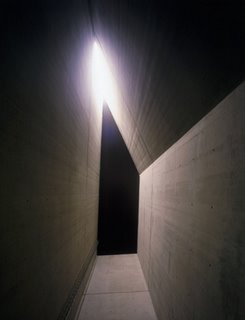
For a start, the building has been purposely designed in a contorted, illogical, poorly lit, and constricted manner. I mean it doesn’t even have a front door for fuck’s sake! Imagine how uncomfortably crowded this building would be if a tour came through. The inside of this architectural dog-turd reminds me of a cave I once visited in Chattanooga TN.
Observe how much space there isn't for odd-shaped exhibits. It seems that only small freestanding objects and wall-mounted exhibits can be displayed here. How, for instance, could this museum do the sort of exhibitions that Auckland's War Museum or the Award-winning Army Museum at Waiouru put on? I went to the ‘Scars of the Heart Exhibition in Auckland and saw a full scale mock up of a WWI Trench system and a real Spitfire. At Waiouru, there are static displays that include an entire Infantry landing craft, artillery pieces, small arms, helicopters, entire armored vehicles as well as photographs, books, medals, uniforms and the like. The Army Museum at Waiouru and the War Museum in Auckland may not look like a hell of a lot from the outside. However, they remain true to their primary purpose: to be an objective forum for history, to be a repository for primary sources regardless of their type and size.
 And not only that, well-designed museums -- places like FLW's Guggenheim for example – are set up so that the building doesn't inhibit the punter's ability to view the exhibits. Good museum architecture should allow the punter to examine an exhibit from as many angles and directions as possible: from above, below, from close in, to the middle distance, and beyond. Good museum architecture should allow the punter to flow against the tide of the crowd, to skip exhibits that he’s not interested in and reexamine others. It should also provide spaces where you can stop and contemplate what you have seen. Why? Because a museum is also a place for thought, for reflection, for comprehension and integration of the lesson that resides in the history being presented.
For these reasons ‘Between the Lines’ does not classify as good architecture. The architect has gone out of his way to make a disjointed, cramped, dingy, constricted building that unilaterally imposes ~his own~ post-modernist illogical and retarded version of German-Jewish history on everything that will be displayed in that museum.
 There is one more ghastly effect of Libeskind’s that casts a further disgraceful pall over proceedings: The built-in affectations of this building are allowed to overshadow the real lesson of the holocaust.
In truth, the holocaust occurred because, in a moment of willful ignorance, the German people allowed a psychopath to become their master. As Edmund Burke put it, “All that is necessary for the triumph of evil is that good men do nothing." Too many good Germans did nothing while a psychopath and his chums took over.
Had Libeskind been satisfied simply with allowing history do the talking, this is what would have been said. But then perhaps he wouldn’t have achieved the fame and fortune through this building that was clearly the real brief he gave himself: to get noticed.
Instead, what we have here is yet another post-modernist wank-session set in stone.
Alternatively, to use Libeskind’s own words "...two lines of thinking, organization, and relationship. One is a straight line, but broken into many fragments; the other is a tortuous line, but continuing indefinitely. These two lines develop architecturally and programmatically through a limited but definite dialogue. They also fall apart, become disengaged, and are seen as separated. In this way, they expose a void that runs through this museum and through architecture, a discontinuous void.”
What a worthless waste of space. If this is an architectural masterpiece then so is my arsehole. Unlike Libeskind’s museum it actually does the job it was designed for.
LINK: Den 5: Jewish Museum, Berlin - Daniel Libeskind
RELATED: Architecture, Art
15 comments:
Ahem,
Just to clarify, I've got a PhD in Molecular Biology not architecture. As far as architecture goes, I'm an opinionated layman.
So Peter has been slightly naughty in using the Dr. prefix in front of my name. There are only two occassions when I refer to myself as Dr. (1) When I'm doing formal deeds related to the topics in which I gained the degree. (2) When I'm trying to obtain a free seat upgrade from an airline...
I found the museum disappointing when I visited it, but one related point - the Holocaust didn't happen so much because good people did nothing, but in fact a sizeable proportion of the German populace bought into the anti-semitic project. Many Germans were not victims, they were active participants.
"Many Germans were not victims, they were active participants."
Do you think that might be because those who did know better didn't stand up and offer an loud and effective moral- and freedom based argument to counter the Nazi's bullshit?
And I forgot to add that that I never claimed that the Germans were innocent victims.
I used the phrase ~willful ignorance~ on purpose.
RW said: "For a start, the building has been purposely designed in a contorted, illogical, poorly lit, and constricted manner. I mean it doesn’t even have a front door for fuck’s sake! Imagine how uncomfortably crowded this building would be if a tour came through"
Ohh, sounds awful. Awful like a conentration camp or something . .. wait a minute. . .
- brlzbue
Brian S has got it in a nutshell. The building invites the visitor to reflect as opposed to didactically telling one 'what to think'.
Rather than 'fisk' your (rather angrily worded) attack on Libeskind's intentions, I'll tackle your argument as a whole.
Your description of the ideal museum as a 'neutral box' - one that presents the best possible viewing conditions for the works contained within - is a sterile and emotionally lacking one. Your later concession that an architect has a 'right to express himself artistically' is too little, too late. Conveying the story of Jewish people in Berlin through the design of the museum was AN INTEGRAL PART OF THE COMPETITION BRIEF. Libeskind won (not uncontroversially) because the jury felt that his design was so powerful and effective at fulfilling this requirement - of telling the story of Jewish people in Berlin, without waving the giant guilt-stick around. It is precisely BECAUSE the museum doesn't offer up a vision of 'unrelenting tragedy' that it is so succesful at providing an 'emblem of hope'.
It comes across very strongly that you have based your entire critique on just the images I provided PC with - clearly you have access to further information regarding the building (ie the underground access etc) but to describe the building as 'poorly lit' and without sufficient space for 'oddly shaped exhibits' implies a very limited understanding of the building.
Furthermore, with the 'two lines' motif the building effectively speaks to much more than simply the holocaust. I purposely limited my little homily to the building to the major features, but Libeskind's design sprang from the cultural tapestry of Berlin, from historically important Jewish figures, from triumphs and from tragedies, and all of this is reflected within the building. If you like, I can provide more information.
The museum's circulatory route is certainly a little more restrictive than larger museums, but more and more, this is the track that smaller 'boutique' museums are taking - telling a particular story by leading the eye on a predestined journey. If you like, I can also post up several recent examples of this type of museum/exhibition design.
It is a poor argument you make, that Libeskind's museum fails as a museum simply because it does not live up to your own, sterile and dated conception of the ideal museum, one that would be entirely inappropriate to the architectural challenge in this instance.
The backers of this museum never wanted a sterile box, which nestled non-descriptly amongst the other buildings in Berlin, nor did they want a bleeding-heart sculpture attesting to national guilt. What they got was a brilliantly-conceived gem of a building which speaks directly to the entirety of Jewish history in Berlin, and embodies hope, rather than 'tragedy'.
Obviously I'd like to hear from PC on this one (who has implied that he is bursting to comment) - and also on the arch comment made in that post on 'winning a bet'...
DenMT
"Peter has been slightly naughty in using the Dr. prefix in front of my name."
Me? Slightly naughty? Never. :-)
Anyway, let me offer an architectural observation, and then perhaps a historical one.
Have a think about this. Not to defend the building, since it is the very opposite of one my personal favourites, but I don't think Dr Robert has quite addressed the question of whether or not this building is good architecture.
Sure, he's explained that he doesn't like it (which is to say that his own subjective assessment of it is negative), and he's argued that it doesn't fit the brief ... but I wonder if he's considered this: that the claustrophobia and dislocation and feelings of alienation evoked by the building and that he describes and the pictures depict are precisely those that are intended by the architect?
Is it possible then that the building itself is the chief exhibit here, and by virtue of its architectural qualities it gives a context to the exhibits that would just not be there in a lesser space?
Is it possible too that these qualities help to demonstrate my argument that if architecture contains within itself the means by which to evoke certain emotions, then art is objective in the means by which it affects us?
How about that?
Like 'The Scream,' which is an example of good art that I really don't like, could it be that this museum is good art that you and I simply don't like because of the qualities that, like it or not, it very definitely does exhibit?
Could it be that those emotions of claustrophobia and dislocation and feelings of alienation are entirely appropriate to this subject, and if they aren't evoked in such a project then the architect simply isn't doing his job? That they are emotions entirely appropriate to be evoked here, and evoked all too successfully?
But, and this is a challenge here to Den, the fact that such powerful emotions are and have been evoked architecturally suggests there is an objective basis in the way that architecture can and does evoke emotions. Doesn't it?
As I've suggested, our own assessment of a work of art or architecture is subjective (best expressed in the form I like/don't like it), but the means by which the art or architecture evokes emotions and expresses values can be understood and evaluated objectively, and it is this latter judgement by which we measure what is (objectively) good and bad art, as against just offering our own (subjective) personal favourites.
On the subject of the Holocaust itself and the what and who caused it and carried it out, might I suggest two excellent books.
The first is by Leonard Peikoff called 'Ominous Parallels' -- it describes the philosophical history of the rise of Nazism, explaining how the land of poets and philosophers became a nation of monsters, how the ideas that fuelled the atrocities were so easily accepted and so widely embraced. Chapter one is online here.
The other book is 'Hitler's Willing Executioners: Ordinary Germans and the Holocaust' by Daniel Jonah Goldhagen, which brilliantly analysesthe people who carried out the atrocities.
Brian S:
"Germany has a long tradition of violent anti-Semitism..."
OK, so you've taken issue with one sentence in the several dozen that I wrote, perhaps you will address the rest of my argument and tell us ~why~ you like the building.
_________
You make an arugument that 1930s-vintage Germans were somehow congenitally pre-programed by tradition to liquidate Jews en-masse.
To which I answer: Bullshit.
Our futures are not ordained by fate, tradition or some 'friggin supernatural third party. We have free will. We have brains.
And the only way you could accept that Hitler wasn't bad news, was to willfully close your eyes to the goings on around you.
Hi Den, our posts crossed each other so I hadn't realised you'd already commented.
I was bursting to comment. I thought Robert's piece was a good foil to help bring out the issues here both artistic and historic, and so it's proved.
And what of the bet? Once I saw your first choice, the Switchbox in Basel, I made the prediction with Robert (based on what I thought yout tastes would be) that Libeskind's museum would be one of your five picks.
Not a bad prediction, huh? ;^)
But I hadn't realised I'd posted it publicly?
Brian S. suggested, "I think the Berlin museum is in fact offering a *loud* and effective moral argument against the return of this bullshit in a place where such arguments are needed the most."
Whatever else it might say, I don't think it says that.
One major problem with the building in that respect is that it almost suggests that anti-semitism and atrocity is the natural course, however horrific, with no way out and no hope for the future.
It's never been clear to me that the building expresses any progression as one explores it, and the form the building has been given has no natural end -- one can imagine it winding snakelike over the rest of history, with the horrors evoked continuing on into the future.
If it portrays the horrors well, as i suggested in a previous post, then I don't think that (architecturally at least) it suggests any end to the suffering.
Given the subject, I personally think that's appalling. For the artist to raise and evoke such powerful emotions has to be more than just cathartic, there also needs to be release.
Quick question, how many of these buildings have you guys actually visited? (excepting the at least one is only on paper)
Insider
Insider, you asked: "Quick question, how many of these buildings have you guys actually visited?"
Quick answer: Of my own favourite four buildings that are standing I've visited one, John Soane's House.
I'm sure Den will agree with me when I say that visiting and experiencing a building on site is by far the best way to appeciate it.
However, with a plan acting like a musical score, and photos and sketches and elevations and sections and accounts from others who've visited acting somewhat like small snatches of a tune, an experienced reader of an 'architectural score' will be able to put a building together pretty well in his or her head, just as an experienced musician can from a musical score and a few bars of the themes.
But that said, I do intend to visit all five of my own favourites, and I might even add this museum to the list. ;^)
Robert, including a picture of the wrong museum will not aid your bitter ramblings against what is accepted as a successful building.
Robert you need to stop considering museums objective, no museum is objective and no museum will ever give you a plain narrative nor a free space to create your own thoughts... brought from nothing.. everything has been molded and framed by human cognition and shit - get that into your little head and try to extrapolate such information to best serve your amateur ~love for architecture~
Post a Comment