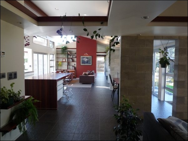
I couldn’t be happier with how this house has turned out – and I sense my clients would say the same.
I posted it here a few years back (here and here), but now the plants have matured – and since it’s been featured in the Waikato Times this month, I figured it was about time I showed it here in all its glory.
Who would have thought this could be found just five minutes from the centre of Hamilton.
The Waikato Times called it “an outstanding Hamilton home, surely one that is among the finest ‘House ‘n’ Lifestyle’ has featured.” Naturally, I agree with them . . . but I bet they say that about every house. ;^)
The house offers a private front to the street, and opens out from within to four landscaped ‘courtyards’ created to integrate site and house.
I won’t say too much here, since you can read about it in the ‘House n’ Lifestyle’ feature linked below – but seeing a house completed to this standard and the clients enjoying it as they are is the reason I do this job: to bring their dreams into reality by doing what they would do if they were a good architect.
- Floor Plan
- Elevations
- Feature in Waikato Times ‘House n’ Lifestyle’ section [6MB to download]
- More photos, courtesy AvO.
- Visit my (imminently updated) Organon Architecture website.
- Book a Design Consultation with me [PDF] so you can get started on building your own dream to come home to.


16 comments:
Art you live in!
I was privileged enough to stay two nights in this house and can vouch for its comfort, warmth and ambience. Great work, PC.
I was once walking around that piece of land, a few years ago with no house on it at that stage. Its beautiful, when you look at it now, with everything is being completed, not only the garden but the house itself. Great work!
It looks just like the kind of house I'd love to live in. Well done.
Pity you were not given credit in the story...
It's a ripper of a house. There isn't a photo of the library here (there is in the Waikato Draught article) unfortunately, but it is just a perfectly designed room for books and reading.
The (proud) owners showed me through this home earlier this year. It is stunning - and actually is even better in real life. Loved the library and just wanted to sit down and read one of the many books on those bookshelves.
Congratulations PC.
Julian
I like that very much Peter - There are lots of things:
That kitchen dining area has created a great space.
The blocks inside.
That little block corner thing on the view of the outside with the little windows in it,
that corner window with the stripes across it.
Love those little opening windows up high, and the little block dividers that stick out to divide the rooms,
and that linear looking bookcase.
Please keep all those in mind when you design my place
I personally have an aversion to raking windows - they suck
So do gib-board ceilings - eeuuch
Thanks everyone. 'Preciate that.
@Anonymous: I suspect that newspapers don't like to credit designers in those sorts of pieces. Makes it more folksy, or something.
@Tomahawk: Every house should reflect its site, its surroundings, its owner. Like I say, I like to do what you would do if you were a good architect. :-)
I do like the Zen ideas in the water feature and the openness of the living / dining area.
@Eric & Julian: I've added a picture of the library just for you. :-)
A credit to you, sir.
Well done. An excellent building.
Superb looking house Peter. I was a bit worried scrolling down and just seeing that first photo, but of course that side of the house (garage) is designed mainly to give privacy from the road. When you then look at where you do live, plus the photos of the private part of the house, it's stunning.
Did you design the water features outside (or design the house with that in mind?)
We are very proud of our new house and garden. It's everything we hoped for and much more! The finished product speaks for itself - it's perfect for us.
Peter not only designed the house but also the letterbox and some of the furniture (e.g. kwila cabinet and shelving in family room). Even the coffee table in the lounge (shown in the Waikato Times article), based on a Frank Lloyd Wright design, was given a new twist - improving on the original. He also gave us many ideas for the landscaping.
The whole process was fascinating and enjoyable, and if you're looking to build or renovate, we unreservedly recommend Peter's architectural services.
Thanks Peter!
that Tom Hunter said......
Van Oostrom? In Hamilton? And there is a Peter Cresswell link via Objectivism.
Damn - I knew it had to be Albert and Monica. Hi guys. Good to see that you're flourishing after all these years. Love the house.
Inspiring. Want to get me one of those. Good work.
Post a Comment