Writing about the onslaught of modernism back when was it first fashionable in Manhattan -- that is, back before retro was 'retro' -- Tom Wolfe described being constantly inflicted with photos of THAT apartment. It was always the same one ..-
Every respected instrument or architectural opinion and cultivated taste, from Domus to House & Garden, told the urban dwellers of America that this was living. This was the good taste of today; this was modern, and soon the International style became known simply as modern architecture. Every Sunday, in its design section The New York Times Magazine ran a picture of the same sort of apartment. I began to think of it as THAT apartment. A glass and steel box in which "the walls were always pure white and free of mouldings, casings, baseboards and the rest... Somewhere near there was always a palm or a dracena fragrance or some other huge tropical plant, because [the apartment] and all the furniture was so lean and clean and bare and spare that without some prodigous piece of frondose Victoriana from the nursery the place looked absolutely empty. The photographer always managed to place the plant in the foreground so that the stark scene beyond was something one peered at through an arabesque of equatorial greenery. (And that apartment is still with us every Sunday.)They went away for a while, but I have to tell you that apartment and the lounge that goes with it are back and flourishing in contemporary NZ architecture! And instead of the palms, rubber plants and prodigious pieces of frondose Victoriana used to transform the photographed starkness, these soulless contraptions rely on the stunning New Zealand landscape to breathe into them the life the architect failed to.
I kid you not. You see it in every issue of every NZ architecture magazine -- you see it so often you have to check the cover to make sure it's a new issue, and the caption to make sure it hasn't been designed a continent away and sixty years ago.
So I opened a recent book Architecture: Inspired by New Zealand with excitement. I should tell you that the book (and the architecture) has grand aspirations. It promises
another look at the New Zealand landscape through the eyes of NZ architects, photographers and writers. [Twenty-two] buildings have been juxtaposed alongside images of nature and are accompanied by ideas about the notion of site ... [and] collected together as examples of how each unique environment has inspired the architect to produce a different solution as to how a house can interact with the landscape as well as accommodate contemporary modes of living.Inspire, by the way, means "to imbue or animate (with); to infue or instil (as emotion in or into)..."
Had I somehow missed a new breed of exciting New Zealand architects truly inspired by our breathtaking and ever-changing landscapes and integrating architecure and landscape? Were there perchance some overlooked gems that were a grace instead of disgrace to their beautiful local locations? Were there some New Zealand architects inside who were truly inspired by the almost God-given beauty of this country of ours? All too sadly I have to say that, with just a few very near exceptions (houses by Melling + Morse and Ron Sang and Felicity Wallace and even Pete Bossley contrive to break the mould somewhat), no, there weren't.
 Instead, what appears to be the same house in all essentials is dropped into twenty different settings -- settings you would kill to design for -- and author Amanda Hyde de Krester (PhD) accompanies pictures of these places with telling phrases such as "the architect has designed a vantage point from which landscape is viewed as art," and "the site is an expectant reality, always awaiting the event of construction, through which its otherwise hidden attributes will appear," and" the architecture interacts with the landscape not in a deferential way, but by framing and contrasting it," and "the house has been designed to present the landscape to its occupants perfectly."
 Closer inspection reveals that for the most part the landscape has been "presented to its occupants" by the simple expedient of framing up a box and then wrapping it in glass, and that while sometimes the house wears a different hat or a different shirt, once all all the candy floss and artifice is stripped away, at the very heart of these places is almost always that lounge.
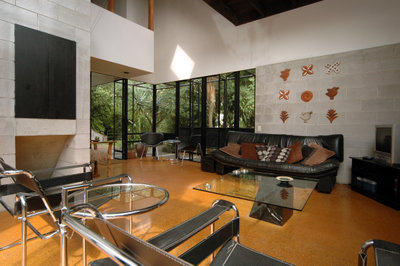
  A picture window with a flat ceiling, downlights and a view. A gorgeous view. But of integration of architecture and view (let alone inspiration or animation) there is none, if any.
 All the photos shown here bar one are from the award-winning houses in that book. And I assure you, they really are all different houses, not just the same one at different times of the day ...
 Of the twenty-two houses inside, then, nearly twenty of them are substantially the same house -- glass boxes whose "dialogue" with the unique landscape in which they've been dropped consists of a bare "pardon me" as they push their way in and sit silent -- a series of glass boxes all too open to the heat and glare of the afternoon sun, with -- at their heart -- as their culmination -- a flat-ceilinged box with glass walls, expensive furniture and nowhere to put your drink. That lounge!
  At the very place in which you expect to find the very heart and soul of the house, that place in which the occupants can engage daily with each other and that unique landscape that's all around them, you find instead an antiseptic airless and soulless box where the sun is an enemy and "the view" has been treated as just so much wallpaper, and the occupants as so many props for a one-off magazine shoot.
 I swear you can almost hear these places echo -- and most likely with the saddest sound of all: the sounds of what might have been...
 Far from "different solutions" that have been "inspired" by the unique landscapes in which they're located, instead of buildings that grace instead of disgrace their locations, that connect the people within to the beauty without by means more artful than just window walls and a sliding door (and some curtains to keep out the inevitably overpowering afternoon sun), you would think by comparing them that the twenty architects were all reading the same magazines, and that those magazines were telling them how to suck the very life out of a site. And you might well be right.
The lesson is that it takes more than some grand talk, koru patterns and a glass box to "interact" with and be inspired by the New Zealand landscape.
 Contrast this sterility with the approach of NZ architects like John Scott and Harry Turbott and Claude Megson -- or with the designer of the rugged beauty I spotted manfully riding the wild hills out at Bethell's Beach on Sunday -- who were able to almost artlessly drop a house in a setting and immediately bring the landscape outside alive, and even reflect it in the spaces inside (above and below).
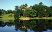
 Or contrast it with architects such as Frank Lloyd Wright with his Prairie houses and his Usonian houses and his Californian 'textile block' houses; his houses for deserts and waterfalls and clifftops; for the rolling hills of Wisconsin (above and below), the lakes of Tahoe and the earthquake-prone landscapes of Japan ... which are of the site instead of on it, their addition making the landscape sing and the occupants with them.
 Or contrast it to the Japanese idea and techniques of Shakkei, of 'borrowing scenery' to bring the view inside and 'capture it alive,' instead of sitting there in your glass box with your blinds drawn or glass tinted and the view floating outside like a butterfly pinned to a cushion.
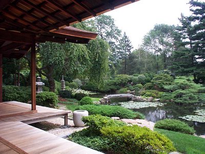 Or contrast it to what an honest New Zealand house anchored in the New Zealand landscape might be like: a truly New Zealand house using honest materials and honestly responding to the New Zealand experience and the New Zealand landscape, instead of simply recycling glass and steel knock-offs of something that didn't really work fifty years ago.
That lounge really has to go.
9 comments:
The better half and I have a code phrase for furniture that would sit well in that lounge - Hilton lobby. You know, the kind of stuff that's carefully calculated to make no lasting impression on you whatsoever, no matter where you are in the world. Everything from the chair in the lobby, to the towels in the five hundred identical bathrooms are established in a studio in New York, and replicated with the same kind of mania Busby Berkeley brought to choreographic mass kick lines.
Which is, I guess, comforting enough if you're so jet-lagged you want to puke all day and sleep for a week. But is it anywhere you really want to live?
Great piece of writing, PC. I also agree with Craig on the soul-less furniture. I first saw that type in the rec rooms of offshore oil rigs in the 70's. Rectangular, functional, and nasty. Now elevated to a high art by designers with similar brains.
Are the glass boxes a failure of the architect's imagination or of the client's lack of taste? A wish to be merely fashionable?
(and if those seem like stupid questions, I plead ignorance of architecture but a real interest)
The Japanese house, spilling into the garden is lovely.
CRAIG: "...is it anywhere you really want to live?"
Not if you have a soul, or any sort of sense of life.
GEORGE: "I also agree with Craig on the soul-less furniture. I first saw that type in the rec rooms of offshore oil rigs in the 70's."
:-)
KG: Short answer is, 'all of the above.' Best longer answer I think is to get hold of Tom Wolfe's book 'From Bauhaus to Our House.' Still relevant, and still hilarious.
Thanks, I'll go look for it.
A very interesting and informative article PC.
What if you appreciate BOTH kinds of architecture?
I really love the architecture that creates a place that you really want to "be in!" - When you see a picture of a room or stairway or whatever, and would really like to be there and experience the "FEELING" of that space.
These areas generally tend to be BUSY, complicated, small or enclosed, with lots happening.
However, I can still find appeal in "THAT LOUNGE" - just not the same alluring atmosphere as in the above.
There is something attractive in a different way about the open spaces, straight lines, uncluttered and simple spaces!
Can I have BOTH please? (not all in the same room of course - but in different areas of the house)
This little post from a blogger I follow is so much more evocative than all the intellectual stuff on the topic. A bit emo for you probably though ;-)
http://fromthearchives.blogspot.com/2007/11/you-should-have-seen-it.html
nice piece PC. I do like some minimalist architecture I've seen though a lot of the stuff like 'THAT lounge' has always seemed soulless & uninviting. A nice composition to view but not to be disturbed by actually living in and interacting with. I can imagine Wynand Gail having THAT lounge. From what you're saying here good architecture also relates to the context of the surroundings? I'm gonna have to read some more of your thoughts to understand this,
cheers, j
To be honest, I have always been a huge fan of minimalism. To look at, I mean. The slick, clean lines please me, the planar expanses of benchtop and shiny, polished wooden floorboards are so nice and free of clutter, spanning the majestic distance to a conveniently located huge glazed wall, which invariably looks out on a carefully chosen, sickly looking tree in a perfectly square patch of pebbles, on an immaculately manicured lawn overlooking an archetypal clifftop sunset.
I like looking at minimalist architecture, and I feel no shame. I envy the people who can find it in themselves to inhabit such stark spaces; always having to hide the remote and the teatowels when company's around, and probably endlessly getting loads of junk stuck in the trickily negative-detailed wall trims and window jambs. But I don't feel sorry for them, because I'm sure they have people that are paid to get the junk out, and carefully square up the single magazine flush to the edge of the coffee table, and all the other tasks essential to minimalist living. I do feel a bit sorry for any kids that inhabit minimalist houses though, who probably spend miserable lives lacerating themselves on rigorously squared table edges, tripping over and sliding forty metres into a huge picture window on the near-frictionless polished floorboards, and constantly being told they can't have their friends around to play unless they wear white one-pieces that tone with the furniture.
It really is one thing to appreciate the aesthetic qualities of a style of architecture, and to then contemplate living in it. All sarcasm aside, I really do like the stark minimalist look, I just have no idea how one goes about inhabiting it. But in the images that PC has put up, one starts to get a sense of what it is that brings life and soul to these spaces. It is all too easy to conceive of these seemingly barren, glass-dominated caverns as an architectural lowest-common-denominator, a one-size-fits-all to suit people with lots of cash but no idea of what they like. A sort of empty vessel, a museum or art gallery.
But that sort of glib characterisation ignores the careful privilege of views, the siting of the building mass, and the shape and volume of the elements, which can all be used to effectively open the building up to it's surrounding, gathering up significant landscape features and incorporating them into the architectural composition. I fundamentally disagree with PC when he says that the minimalist/'Modernist' approach featured here can be dumbed down to simply "present[ing landscape] to its occupants".
In the fifth image down, for example, I reckon the success is in the absolute simplicity of the forms - the long, flat ceiling opening out onto what one imagines is a seaside view, perhaps the previously mentioned archetypal clifftop panorama; the central stony plinth appearing to float this element up off the ground - it is clear that the architecture is almost trying to dissolve, in order to merge with the landscape.
It is almost the antithesis of treating the landscape as 'a butterfly pinned to a cushion' - in fact, the reduction of the architectural enclosure to simple planes which emphasise that which lies outside the walls does far more to venerate landscape than a simple picture window in a wall.
So back to my disclaimer. I really appreciate minimalist architecture. However, I couldn't possibly live in it. My own personal, naturally subjective taste (for as PC will tell you ;) the aesthetic value of any architecture can never be truly objectively quantified) is for simple clean lines, but at a livable scale. Using comforting, true, local (and environmentally sound) materials always, and privileging the site over anything else. Always letting the architecture tell a story, whether it is an overt, strident narrative, or a careful but omnipresent subtext.
Like my politics and my lady, I get my stylistic cues straight from Scandinavia. A lot of the architecture coming out of Sweden and especially Norway right now epitomises exactly the issues I raised above - a real sensitivity for the use of materials, a palpable sense of the local within the architecture, and maximising the use of the site - the capture of the genius loci... I am pretty excited to be shipping out to Sweden next year to work, as even the larger firms seem to share my enthusiasm for environmentally sustainable design (yes, PC readers, dry-retch away).
Bottom line, I agree with many of the above posters that minimalist spaces seem a bit scary to imagine as living spaces. I don't agree at all, however, that they do nothing to incorporate the landscape. If anything, the simple volumes and airy, unencumbered nature of the spaces helps to integrate the architecture with it's surroundings.
DenMT
Post a Comment