 My own second post in this competition of architectural favourites has already been trumped by Den's post last night of Frank Lloyd Wright's Fallingwater, but never fear: Wright has nearly 600 projects to choose from, every one a gem.
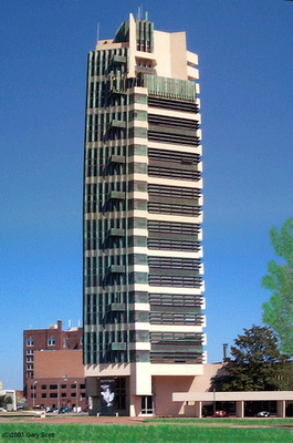
Here tonight is his only completed tall building: the Price Tower, or as so he often called it, "the tree that escaped the crowded forest."
 First designed for the New York of the twenties, and then as part of an apartment cluster in Washington DC in the forties, it was finally built in Oklahoma in the fifties (yes, that's right: Oklahoma again; and architect Bruce Goff lived and kept an office there.)
 The Price Tower wasn't the only tall building Wright had worked on. He began his career in the office of Louis Sullivan, who in the Chicago of the 1890s when tall buildings were still a new thing under the sun, largely invented the means of expression of the tall building. As the "pencil in the hand of the master" as Wright was happy to call himself, he helped Sullivan build the first skyscraper masterpieces the world had seen, before leaving Sullivan's office to begin his own practice.
The Larkin Building of 1905 was his first tall-ish building on his own account (and some fity years before the so-called seminal 'modern' high-rises were erected in Chicago and Manhattan), and a revolutionary one it was too, but for all sorts of reasons numerous design, studies and projects just flatly refused to get off the ground or to find a backer -- the Mile High Tower was one project used in part to attract attention for all the many ingenious schemes Wright had devised that were just going to waste -- so the Bartlesville opportunity when it came was grabbed with both hands.

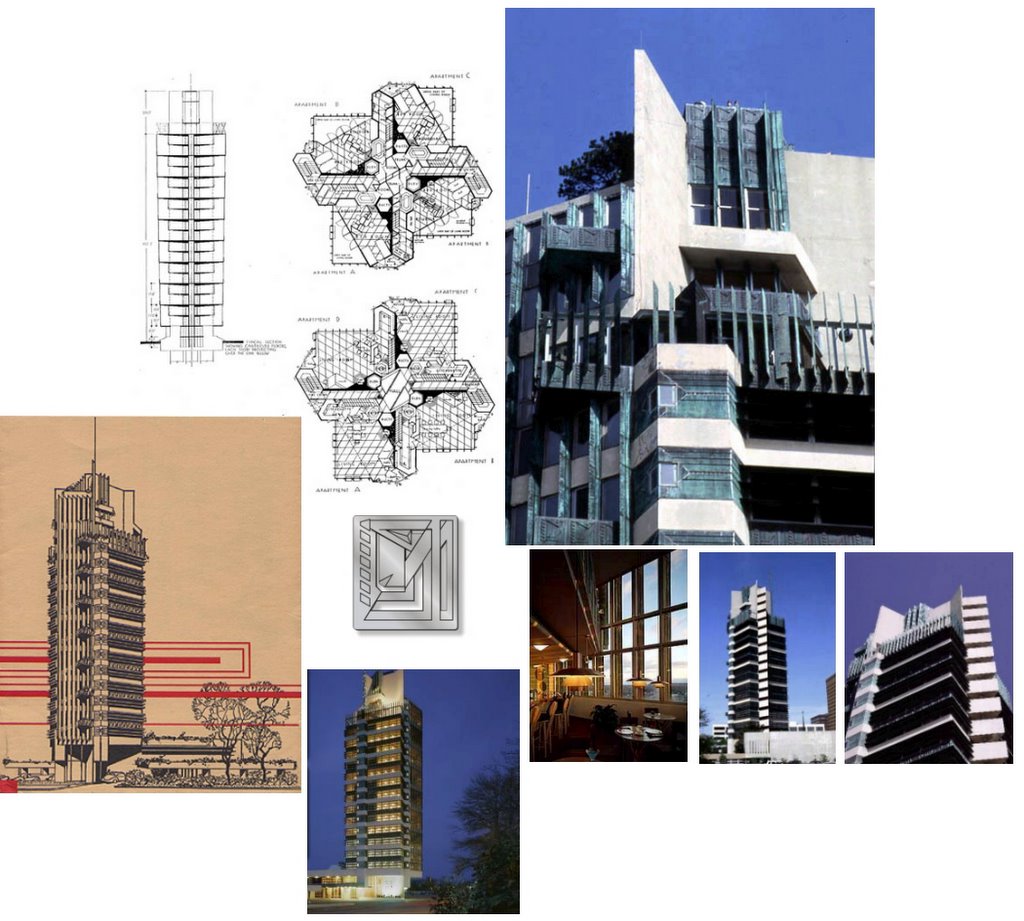
 The Price tower itself picks up on the form of a tree: like a tree, it has a 'tap root,' a central structural core that extends down into the ground to hold the building erect. From this vertical core, the floors are cantilevered out, like branches from the trunk. And at the exterior, like the foliage at the perimeter of a tree, light and shade and decoration are made to appear. It followed the principle of the tree, said Wright, but to that he added his own inescapable ingenuity to the mix.
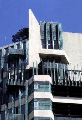
 The floors, combining rental offices and apartments on each floor, are laid out using an ingenous grid system, with 'nodal points' such as interior mezzanine balconies pushed out to the exterior to gve a delightful geometric variety. At the edge of the cantilevered floors, each wall is treated differently depending on function and sun direction. Vertical copper sun shades are used to mollify the afternoon sun; pressed copper panels bear the imprint of Wright's imagination, rather like the beautiful foliage of a tree that decorates its perimeter; concrete 'fin walls' rise vertically through the building from its 'tap root,' bursting out at the top to anchor a playful geometric composition that crowns the bulding, and silhouettes it beautifully against the sky.
 The overall effect is of a building almost shaped from crystal, like a jewel. It's masterful play of geometric form is, I'll use the word again, a delight. Unlike all too many tall buildings (like Auckland's pathologically disinteresting Sky Tower for example) it is different on all sides: like an ingenious puzzle it is a form that the eye never tires of taking it in and working out, all the time trying to establish the underlying principle that built it. To use Wright's words, "it is a grace, and not a disgrace" to the world in which it is built.
It is a building that is proud to be tall, and proud to be erect. It is by any standard a delightful building, and definitely one of my own top five.
LINKS: Louis Sullivan: What's the big idea? - Peter Cresswell, SOLO
'The Tall Building Artistically Considered' - Louis Sullivan - Not PC
Frank Lloyd Wright's St Mark's Apartment Tower Project - Not PC
Mile High Tower, Frank Lloyd Wright - Not PC
Crystal Heights complex, Frank Lloyd Wright - Not PC
Larkin Building, Frank Lloyd Wright - Not PC
RELATED: Architecture
6 comments:
Top five material indeed!
"Unlike all too many tall buildings (like Auckland's pathologically disinteresting Sky Tower for example) it is different on all sides: like an ingenious puzzle it is a form that the eye never tires of taking it in and working out, all the time trying to establish the underlying principle that built it. To use Wright's words, "it is a grace, and not a disgrace" to the world in which it is built."
In a nut shell that was my biggest gripe about DenMT's first entry.
But the other thing that FLW did was consider what it would be like to live and work ~inside~ the building.
I currently work in a nine-story high box with a single paltry window for the lab and concrete clab walls all around. You exit the lab and enter a long internal corridor bereft of natural light, surrounded by yet more concrete painted in a putrid light green color.
Even during the brightest daylight (and in Kansas the light is often ~very~ bright because the place is so flat, Kansas is often said to consist of 9/10ths (cloudless) sky.) I can only work with the aid of flourescent roof lighting.
Without the lights and the (paultry heating and aircon) the place is dim, dull and freezing in winter and oppressively hot and humid in summer.
I swear there are salt mines that are more pleasant to work in.
By contrast, FLW appears to go to great lengths to free the occupant of the impression that you are in a building at all. I note that you can without exiting the building, see a lot of the sky above the building simply by lifting your head as you enter one of those cantilevered balconies.
To do the same where I work, you'd need to attach yourself to a rope and climb out on of the impossibly small windows.
Too many of the bloody buildings I've worked in afford the best views to the window cleaners rather than the poor sods who work there.
I don't know, but I suspect that Den's favourite signal box has most of the internal "features" that I've just been lamenting.
IMHO, Modern architects should be condemned to live and work for a year in the building they construct before signing it over to the owner... See how they fucking like it!
Interesting how the Swastika was worked into the design of the Saint Marks tower....;-)
Well it does look like one viewed frow above.
Hey architecture nuts look up Curitiba
James, James, James ... [shakes head and walks away]
Robert, you said, " 'To use Wright's words, "it is a grace, and not a disgrace" to the world in which it is built.'
In a nut shell that was my biggest gripe about DenMT's first entry."
Mine too, truth be told. Wright's aim with all architecture was for it enhance the life of those people who experienced it, and by this he meant the experience from the viewpoint of the observer and the occupant. Architecture, he thought, should not just support a particular function, it should enhance the experience that it supports, and so enhancing human life.
"By contrast, FLW appears to go to great lengths to free the occupant of the impression that you are in a building at all."
That's right. He was always, always insistent on the connection between the occupant and the world around them -- an important link that ninety-nine percent of his buildings were designed to celebrate. (The one-percent that didn't were in locations such as Racine where the surrounding landscape was so awful Wright designed an interior landscape as a substitute.)
Well it does dammit! A = A, facts are facts etc... ;-0
Post a Comment