There’s been a lot of talk about the politics behind the forthcoming Auckland International Convention Centre. A lot of talk about the politics, but very little about the architecture.
Which is a shame, because the architecture is awful.
The problem starts with the site. It’s generally agreed a convention centre is a means by which international visitors are invited to a city, to be presented there with the best that city has to offer. Generally, these things are sited in the best part of the city, so-called “heroic sites,”1 so that these would-be investors, attracted by the sights and then lured in by the business opportunities, can be suitably impressed.
Not this one. Politics mandated that the site chosen is bounded on its two long sides by Hobson and Nelson Streets, each bearing five lanes of heavy city traffic. These are major traffic spines. I attended a full presentation on the new convention centre last week, and for reasons known only to themselves it turns out that the architects of this new smaller centre2 have elected to make the building totally transparent. Transparency is “a value,” it seems. Which means delegates wishing to enjoy the essence of Auckland city will be surrounded by traffic, enjoying the sight of ten lanes of city traffic thundering past.
Which, when you think about it, is a reasonable metaphor for the essence of Auckland city. But not one you’d want to boast about.

A lot of trees are going to be planted, but with no more chance of Nelson St ever becoming the Champs-Élysées than Len Brown ever becoming something resembling honest.
Honestly. That’s just the start of the problem. Because the whole block that the government has so kindly donated to the cronies has been government land for so long that the state of both block and surroundings is already dire. Part of this is the phenomenon of governments as landlords being so generally disinterested in the quality of their holdings; part of it is decisions like those of Sky City’s original architects to locate along Hobson St among the world’s least attractive intercity bus terminals known to man.
This problem too is compounded by decisions made by the convention centre’s architects. Sandwiched between the “front” of their new building and the back of TVNZ’s, they’ve decided to create a “laneway” opening out to that very bus terminal opposite. If by “opposite” is meant looking across five lanes of ever-flying, heavily-breathing traffic.
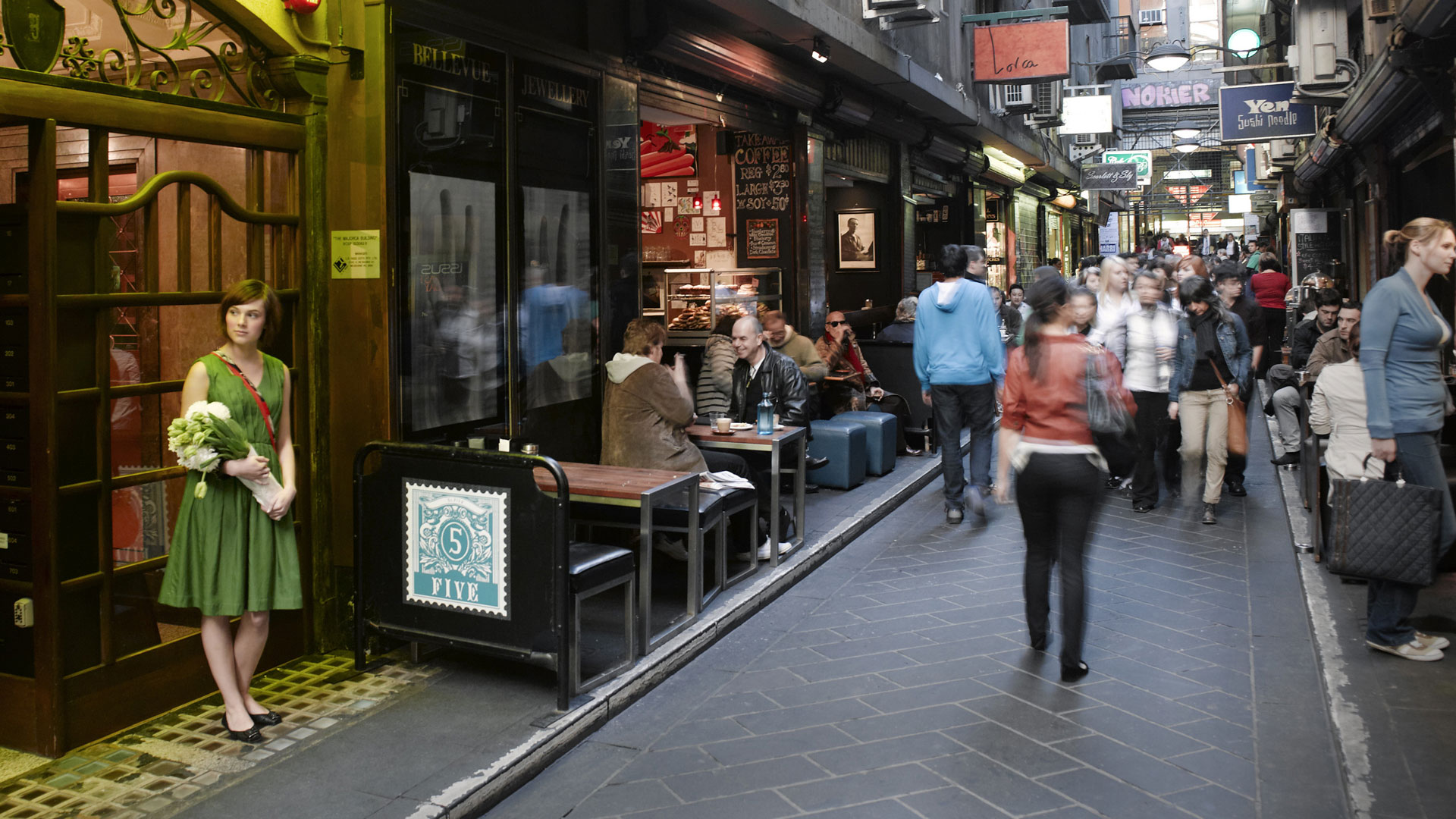
 Laneways can be a success in cities where they provide delightful, small scale circulation routes that can be full of small surprises. Melbourne (right) and even Britomart and Welllington offer some great examples.
What’s being built in our name however is a laneway from nowhere to nowhere, and rather than being small and potentially packed full of surprise its scale instead is vast and institutional.
Of delight, little is either evident, or likely.
But what about the building’s appearance? What of that?
Well, there’s a reason I haven’t pasted pictures of the building here. I don’t wish to repel you. You’ll see it soon enough anyway (and presentation pics of this new smaller centre are easily-enough obtained by Googling, every single one sans the ten lanes of traffic and avec megabytes of photoshop wizardry lamely trying to put lipstick on this pig) but the building can be very easily described anyway: imagine one large ill-proportioned glass box sitting on top of another glass box, with a mess of mechanical shit on top to interrupt the skyline. And … well, that’s about as far as the architect’s imagination went, with only a lapse back into the ignominy of “heritage facadism” on the southwest corner of the block4.
And that’s all there is to tell from the many months of work on this project by some of the finest minds in the profession.
In the architect’s presentation that I was sorry enough to witness, he was excited to say that residents of the Ponsonby ridge will no longer have to endure the view on their horizon of the large red box that constitutes Sky City. Instead, however, they will now have to avert their eyes as the setting sun reflects off the large glass panes of one of the world’s most inelegant ugly duckling.
It’s been frequently observed that NZ architects can often do small informal buildings very well, but are generally horrible at doing anything well on a large scale.
Nothing about this new turkey offers evidence to alter that.
Notes
1. Think Darling Harbour, or convention centres on the likes of the Hudson, Yarra or Yellow Rivers
2. Okay, let’s name those responsible. The architects of the larger more expensive centre were Moller Architects, led by Gordon Moller. The architects of the new smaller centre were changed for reasons that I’m sure would be fascinating to know, and are Warren & Mahoney, led by Andrew Barclay. Look for the latter’s pictures, because they show the centre I’m criticising.
3. In addition to their arboreal additions, the city’s planners also propose removing one lane per street from these important city traffic spines, something which drivers on these already congested streets may not thank them for, but part of an increasing trend in what’s becoming the new Auckland: increasing the pedestrianisation of the city by making it harder to drivers to get around.
4. The historic former headquarters of lingerie company Berlei, designed by American architect Roy Alson Lippincott and which was when it opened in 1931 the second-largest building of its kind in the Southern Hemisphere, will be gutted and only its facade will remain.
No comments:
Post a Comment