It sounds like the start of a joke, i.e.:
Q: What do you get when two economists argue about global warming?
But the answer is less of joke than you might think. In fact, in the exchange between William Nordhaus and Bob Murphy there’s more way more light than heat—much more than any exchange, rare as they are, between climate scientists who hold different views.
Nordhaus, a professor at Yale University and “one of the pioneers in the economics of climate change” took it upon himself to write a piece in the New York Review of Books answering—or attempting to answer—the claims of 16 skeptical scientists published in the January 26 Wall Street Journal as “No Need to Panic About Global Warming.”
The title fairly expresses the view of the 16 scientists. The title of Nordhaus’s response, “Why the Global Warming Skeptics Are Wrong,” fairly represents his.
Murphy takes up the cudgels against Nordhaus because, he notes, “the article was an instant hit in certain circles [because] of Nordhaus’ stature in the profession, and because of his supposedly definitive claims.” Supposedly definitive claims which Murphy proceeds to demolish: “What Nordhaus gets wrong about climate change.”
Sinclair Davidson, David Friedman and David R. Henderson summarise Murphy’s devastating critique, which begins by showing Nordhaus was just a trifle naughty in his explanations.
Nordhaus identified six allegedly misleading claims made by the skeptics in their WSJ article, and proceeded (in his mind) to dismantle their bogus views. In the interest of brevity, I will in this post focus on just four of the claims. As we’ll see, it is Nordhaus who is playing fast and loose with the readers. Many of the objections raised by the skeptics are indeed legitimate.
Murphy proceeds to dismantle Nordhaus’s arguments on
- climate models (climate models continue to be unable to accurately replicate the climate behaviour of the observable past, instead—and virtually always--predicting more warming than has actually occurred. “It is foolish to think that they will produce reliable climate projections of an uncertain future… Consequently, it is reckless to go forth with trillion-dollar taxation schemes on the basis of our limited understanding.”)
- economic damage from global warming (the very study on which Nordhaus, “one of the pioneers in the economics of climate change,” relies is shown to assert the opposite to that which Nordhaus claims for it: quite clearly indicating the consensus of economic studies finds that global warming would be on net beneficial to human welfare, at least through 2C degrees of warming.” On this basis, using Nordhaus’s own preferred studies and the standard IPCC simulations, “the best estimates currently predict that unregulated greenhouse gas emissions will provide net benefits to human welfare for at least the next sixty years”)
- the benefits or harms of carbon taxes (Nordhaus’s very own model demonstrates that, even is the threat is as alleged, the dangers of an overly ambitious or inefficiently structured policy can easily swamp all the alleged benefits of even a perfectly calibrated and efficiently targeted tax of Emissions Trading Scheme. And a perfectly calibrated scheme does not exist. “The worst is Gore’s 2007 proposal to reduce CO2 emissions 90 percent by 2050; Nordhaus’s own study estimated that Gore’s plan would make the world more than $21 trillion poorer than it would be if there were no controls on carbon.”)
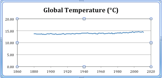
But perhaps the soundest thrashing is on global temperature, where Murphy takes to task the “gee-whiz graphs” used by Nordhaus and so beloved by his warmist colleagues.
It’s also interesting that Nordhaus invites his readers to not get caught up in the tiny details, and instead to take a step back and survey the grand picture of global temperatures. I agree. In that spirit, I suggest it can be misleading to focus—as Nordhaus does—on deviations of temperatures. Instead, let’s look at a graph of actual global temperatures, using the same three standard data sets that Nordhaus used for his own graph. (All we’re doing here is adding a base of 14 degrees Celsius to the deviations that Nordhaus plots.) The graph looks like this:
 SOURCE: Data sets cited by Nordhaus, with 14C base global temperature added to deviations.
Seen in this light, it’s still true that temperatures of the last decade are higher than at any point since the late 19th century, yet this chart isn’t nearly as scary as the one Nordhaus showed.
It’s hardly scary at all, is it. Which is no doubt why warmists prefer the “gee-whiz graphs” and the tricked-up hockey sticks. Sinclair Davidson has his own plot of global mean temperature, with his source being the US Bureau of Meteorology:

Gee. Barely scary at all, is it.
And no sound reason to believe that’s likely to change soon.
1 comment:
You can download Niwas 7 Station record of a similar time frame and get almost the exact near flat graph as above.
Its when people start spouting "anomalies" and chopping the timelines up to produce graphs which produce rises in temp that we have a problem. Being selective like this I can show a more substantial fall in temp 1998-2010 than the entire rise in temp over the whole 160 year record and even graphing the previous 30 years produces a fall in temp.
Incidentally, a warmer climate is one of the most common reasons given for migrating to Aussie:)
JC
Post a Comment