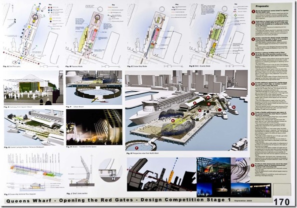
The five first stage winners of the two-week Queen’s Wharf design competition are announced this morning – my own entry wasn’t amongst them, and neither were any that I’d picked in my summary here a few weeks back – and nor were any that are likely to set the world alight. If there’s a winner here, it’s not going be the public.
Just to remind you, the competition was intended to select a design for a new cruise terminal and a “Party Central” for the Rugby World Cup an beyond.
The designs selected to go forward to Stage 2 of the competition are as follows (click on the links to view a PDF):
Design number 024 - Andrius Gedgaudas, Architect, Shanghai China.
Design number 046 - Den Aitken, Pete Griffins and Hamish Foote, Field Landscape Architecture, Auckland.
Design number 170 - David Gibbs and Aaron Sills, Construkt / SVB, Auckland.
Design number 195 - John Coop, Tasman Studio, Auckland.
Design number 216 - Simon Williams, Williams Architects Ltd, Auckland.
(These five designs were selected by, wait for it, Murray McCully and Gerry Brownlee, ARC Chairman Mike Lee and Auckland City Mayor John Banks, “assisted by” the chief executives of the Ministry of Economic Development, Auckland Regional Council and Auckland City Council, and – as professional advisers – Prof. John Hunt, Ian Athfield, Rebecca Skidmore, Jillian de Beer and Graeme McIndoe.)
In total they represent a collection of sheds and seats and shipping containers – in a prime spot at one of the world’s best harbours – that (with the exception of #216 which at least has an overbridge to get them there) are somehow supposed to attract pedestrians from Queen St through a bus plaza, across two busy streets and out to their barren windswept plazas. Sheesh.
Which all rather reminds me of a quote I stumbled across today that you can consider as you view these schemes:
“A bold architectural statement turns a public building into a landmark, but it is in the details where the architect becomes the real storyteller.”
- Curtis W. Fentress
Have any of these here got either of those qualities right?
UPDATE: More blather on this here at the Herald, who repeat the claims of the council’s press release that
“All five were chosen for their ability to strike the right balance between meeting the need for a great public space, act as a major celebration during the Cup and provide a world-class cruise ship terminal.
“Other ideas include using the historic pattern of the wharf, major open space across the width of the northern end, a harbour pool within the perimeter of the wharf and simple sculptural forms for the cruise ship terminal.”


6 comments:
I'd be interested in why you don't like 170? apart from silly bit on the end
Okay, fair question.
Good: there's a strategy to get people out to the end of the wharf.
Bad: there's just a wasteland once they get there.
Good: There's a beach!
Bad: Really?Look closer.
Good: There are windbreaks -- and you need them.
Bad: There are windbreaks -- which look like Sylvia Park has come to landmark central. Yes, they're moveable, depending on wind direction, but this is a council operation here: how often do you think they'll ever be moved.
Good: It's not the most expensive option of the 232 designs.
Bad: Apart from a windbreak a glass shelter and a shed (an existing shed that has just been made bigger), there is nothing here. Okay, that's a bit churlish -- your man has brought the ferries further into the place, a good move IMHO. So apart from the cruise terminal and the ferry terminal, it's not likely to be well-used. Why would you go there? And if you think it's cheap to build since there'd be nothing much to knock up (apart from the mandatory cruise terminal made out of teh existing shed and shed extension), just consider that there's nothing much either to bring in any kind of a return. So just think about the long-term cost and the wasted opportunity.
So them's my short list of reasons: essentially that it's uninspiring and will be unloved.
Do you have reasons for liking it? Apart from the silly bit on the end?
The one headed up "100% Public" is a bit pathetic; trying to gain favour by reinforcing state ownership of what should be private assets.
But won't these all get drowned when the sea level rises by 6 metres?
But won't these all go underwater when the sea level rises 6 metres?
BORING BORING
Certainly will not be a DESTINATION, or a place people will want to come from miles around to visit.
No designs that make you want to visit or go there
195 is dead boring.
Where there any GOOD designs? (apart from your own I should say!)
Post a Comment