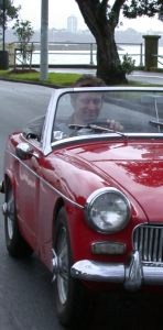
Some folk have been disappointed to see my MG photo disappear from the sidebar. They reckon the new pic is too frightening -- and some others reckon no amount of airbrushing could avoid a picture of me being frightening.
So which picture should I have on my sidebar? This one?
So which picture should I have on my sidebar? This one?

Or this one?

Or none at all?
Vote now:
UPDATE: Here's a late entrant in the competition. For those confused, I'm the one on the right. :-)
10 comments:
The cool one with the MG against another backdrop.
Use another photo of yourself in the MG that does better justice to your ugly (just joking....!)mug. It would be nice to be able to include something like the T-shirt reference to John Galt too, to keep the fear of God in the socialists who might stray into the site.
Wanna borrow my J Galt plate for the pic? :)
Haha... Looks like my picture is the best!
Put it back. ;-)
I'm not sure I can be a part of this focus-group, consensus-building, approach.
- Sam P :)
MG
LGM
Go on, Sam. Take a hug. ;^)
Absolutely have Galt and MG - have em both.
How about a picture of just the MG, the better looking of the two machines? :)
I'll vote for the one of you playing backyard cricket, 'tis at the Libz website.
Post a Comment