Given that their figures are used to support extensive government action to squelch private production, shouldn't they be examined a little more closely? And when we do, what do we find? As Steven Goddard explains at The Register, what we find is sobering. Some lowlights of NASA science described by Goddard:
- "Two authorities provide us with analysis of long-term surface temperature trends. Both agree on the global temperature trend until 1998, at which time a sharp divergence occurred. The UK Meteorological Office's Hadley Center for Climate Studies Had-Crut data shows worldwide temperatures declining since 1998. According to Hadley's data, the earth is not much warmer now than it was than it was in 1878 or 1941. By contrast, NASA data shows worldwide temperatures increasing at a record pace - and nearly a full degree warmer than 1880. The other two widely used global temperature data sources are from earth-orbiting satellites UAH (University of Alabama at Huntsville) and RSS (Remote Sensing Systems.) Both show decreasing temperatures over the last decade, with present temperatures barely above the 30 year average."
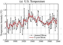
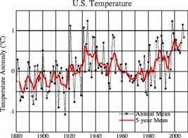
- "NASA has been reworking recent temperatures upwards and older temperatures downwards - which creates a greater slope and the appearance of warming. Canadian statistician Steve McIntyre has been tracking the changes closely on his Climate Audit site, and reports that NASA is Rewriting History, Time and Time Again. The recent changes can be seen by comparing the NASA 1999 and 2007 US temperature graphs. Below is the 1999 version, and below that is the reworked 2007 version."


- "We observe that [NASA's] data has been consistently adjusted towards a bias of greater warming. The years prior to the 1970s have again been adjusted to lower temperatures, and recent years have been adjusted towards higher temperatures."
- "Prior to any adjustments, more than half the US shows declining temperatures over the 20th century - blue and green colors - i.e. the US is cooling down. However, subsequent to the adjustments the country goes dominantly warmer..."
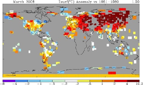
- For the last twenty years, NASA's ground-based (adjusted) temperatures have diverged considerably from the two main sources of satellite derived temperatures. "The divergence is now quite striking. Looking closer at March 2008, NASA's data (http://data.giss.nasa.gov/gistemp/tabledata/GLB.Ts+dSST.txt) shows the month as the third warmest on record. In sharp contrast, UAH and RSS satellite data showed March as the second coldest on record in the southern hemisphere, and just barely above average for the whole planet. How could such a large discrepancy occur?"
- "... NASA has essentially no data (gray areas) in most of Canada, most of Africa, the Greenland ice sheet, and most of Antarctica. This begs the question, how can one calculate an accurate 'global temperature' while lacking any data from large contiguous regions of three continents?
So what was NASA missing?

NASA Temperatures March, 2008 - 250-mile smoothing radius - looks hot.
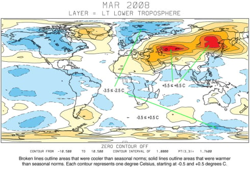
We can find NASA's lost continents in the UAH satellite data for March below.
"Not surprisingly, the missing areas in Canada and Africa were cold. The NASA data thus becomes disproportionately weighted towards warm areas - particularly in the northern hemisphere. As can be seen in the UAH satellite map above, the warm areas actually made up a relatively small percentage of the planet. The vast majority of the earth had normal temperatures or below. Given that NASA has lost track of a number of large cold regions, it is understandable that their averages are on the high side."
"UAH Satellite Temperatures March, 2008 - looks cool.
- "Additionally, NASA reports their 'global temperature' measurements within one one-hundredth of a degree. This is a classic mathematics error, since they have no data from 20 per cent of the earth's land area. The reported precision is much greater than the error bar - a mistake which has caused many a high school student to fail their exams."
 To this must be added Anthony Watts' extensive work on documenting the horrendous state of NASA's surface temperature recording network. Forget the urban heat island effect -- what Watts' team has uncovered so far is a network of contaminated data collection: nearly two-thirds of temperature stations surveyed have been built in close proximity to an artifical heating source, or are either on or next to a building, roof-top, parking lot, or concrete surface. The picture at right gives you some idea of what's considered to be 'good enough for government work.' [Watt's work is summarised here at SurfaceStations.Org, with regular updates at his blog].
So what does this all mean?
As Goddard says in his conclusion, "What is being examined is the quality and stability of the data being used by people making [sweeping] claims. [W]hen the data is calibrated in lockstep with a very high-profile and public political philosophy, we should at least be willing to ask some hard questions. Dr. James Hansen at GISS is the person in charge of the NASA temperature data. He is also the world's leading advocate of the idea of catastrophic global warming, and is Al Gore's primary climate advisor..."
"Both of the satellite data sources, as well as Had-Crut, show worldwide temperatures falling below the IPCC estimates. Satellite data shows temperatures near or below the 30 year average - but NASA data has somehow managed to stay on track towards climate Armageddon. You can draw your own conclusions..."
If you think this is all just an academic debate, then understand that what is being questioned is the quality of the science on which calls to shut down industrial civilisation are based.
Does it stack up?
UPDATE: Naturally, the Greens continue to applaud NASA's "famous" James Hansen, the Chicken-Little-in-Chief of warmist so-called science. They have to, don't they. It's difficult to admit your hero in chief is a complete fuck up.
4 comments:
Just another nail in the coffin of these socialist global warming chaps.
When will everyone realise Al Gore has taken them for fools?!?!
have you been to john-daly.com (or maybe it's john-daley.com) to see the temp recordings? Click on a map of the world to see the charts from the recording stations in that area. In half an hour of random clicking all over the world I couldn't find one which showed an increase since recordings began. Then again, maybe it is an Exxon hoax site.
Collectivists always tell lies. They are fundamentally dishonest. It matters not whether you are dealing with an environmentalist, socialist, social democrat, Christian socialist, communist, national socialist, green etc. etc. etc., they all tell lies. It is a necessary attribute they have and it makes them easy to spot. Next time one of these vermin fibs to you, kick it and stomp it out.
LGM
Ah, El Reg’s Mr. Goddard! Who is he, one may ask, as a “Steven Goddard” doesn’t even exist on the interweb before April 2008.
Yet the Register chose him to continously enlighten us with his views on climate change without criticism. Is he perhaps having some connection to IT professional John Atkinson, who was allowed to post a similarly incoherent article on the Register? Is it just a coincidence that someone using the moniker “John A.” pops up regularly on the blog of Stephen McIntyre, who works in IT as well and is known for making powerful oil interests heard?
Post a Comment