Someone emailed me in support of John Key's bach. Well, of what John Key and a journalist claim is a bach.
They reckon it's a beaut bach, just as John Boy obviously does.
Well, I don't. I know what baches should look like.
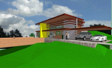
Here's one here. Yes, I've posted it here before, but here's my own favourite unbuilt bach. Relaxed. Casual. Open. Expansive. And yes, it's one I designed myself. Let's call it Holiday House 1. (Click on pics to enlarge.)
UPDATE: The pictures above show the house in mid-summer, in mid- to late-afternoon, when shade is your friend and the large eaves do their work. Here's a picture of the house at the same time of day in mid-winter, showing the penetration of the sun at the time when it's wanted:
11 comments:
I've never been a fan of those... I'll call them "fin thingys" - what are they for?
"Fin thingies"? You mean the pergolas?
Perfect for shading that harsh summer sun. Perfect for expressing the horizontal line of the house. Perfect for blurring the boundaries of where the house begins and ends. Perfect for taking the eye out into the landscape...
What's not to like?
How would the pergolas block the sun if they are already in the shade of the large overhang (as the pictures shows)?
Good question, Joe.
The answer is that those pictures who the house at mid-afternoon in mid-summer, when the sun is high, and you want shade.
But in winter, when the sun is lower in the sky and you want to welcome the sun in and have it warm your floors, the pergolas (or sun shades if you like) act simply as filters, allowing the sun in but taking away the glare.
I'll post a picture later showing the house at the same time in winter so you can get some idea of the effect.
THAT is a beach house!
For modern times, not detracting from the good old NZ shanty!
Excellent effort that. When and where are you going to build it?
And I like that balcony. If it is done right it would be like floating over space. Especially good if the house is over a decent valley. Give some sections of the balcony a transparent floor. It'd be a perfect feature.
Where you gong to build?
LGM
Much better than Mr Key's place. It has been designed for its location, not just to fill a plot.
Hi PC and welcome back. Check your email!
The planning absolutely works for me in terms of offering all of the living space up to the sun and the view, although it strikes me that you've been a bit mean with the access - one set of bifolds to what I'll assume is the west, and a somewhat odd arrangement of three hinged doors all opening on the same side of the leaf to the eastern living space.
I wonder however, why that eastern living space has the large yellow element plonked between it and the 'view' out to the west (assuming there is one). It seems that particular space only has an aspect out to the north, which to me is a missed opportunity. I'm also not convinced by the bedrooms (looks like about 400mm to squeak past the end of the beds in there - holiday houses aren't built for bedroom comfort for sure, but there are limits!)
The massive cantilevering deck is a bold move (what is that, 15m?) - impressive, but the pessimist in me balks at the amount of steel that would be required to pull it off, and whether that sort of cantilever would even be possible? I wonder whether there might be another way to achieve the feeling of lightness that the cantilever achieves. Also as a compositional element it is very strong but something about the scale relative to the house is a bit jarring.
I also find it somewhat hard to believe the apparent depth of the canopy over the carport. If that too is cantilevering (at what, 8ish metres?) it would surely not look as slender and fine as shown in the render.
A final comment, and this is purely personal preference: I reckon you should have either rendered without materials, or traced over the render in butter paper and used that. The problem with 'realistic' rendering is that once you go down that track and present something outside of the sketchy, possibility-laden hand drawing the eye expects a greater level of realism and detail than what is shown. It might just be because modelling is one of my 'things' - I lavish as much time as I can scrape away from other stuff on 3D imaging - but the tiling of the grass texture and other materials together with the 'realistic' model combine to make the image look somewhat cartoony.
DenMT
PS: Without wanting to be all pedantic and things, as I've always understood it a pergola is above your head in an outdoor space. Those 'fins' would be 'louvres', surely?
Hi Den,
Great comments. I thank you for them. However I think the rather small floor plans I've provided might have put a little wrong, and my error in not putting a north point might hav confused you (for clarity, the cantilevered deck points north). And, naturally, there may be a couple of philosophical differences.
OPENINGS: There are six main external access openings, the size and scale of each responding to its position, and to what it relates to outside:
1. Large sliders from the bedroom gallery to the south-eastern 'morning courtyard.'
2. Three hinged glass doors from breakfast area oriented east and south to the 'morning courtyard.'
3. Three hinged glass doors from the low-ceilinged Retreat to the small patio above the large deck.
4. Large sliders from the lounge to the main terrace, and down and out to the large cantilevered deck.
5. Bifolds from the Snack/Card Table area to the main terrace.
6. Main entrance door. This is intended mainly for visitors and for loading and unloading cars. In good weather, residents would generally use Doors 5 and 6 to go in and out.
I'm fairly sure that's ample openings for a generally small internal footprint -- and in responding to context far better to my mind and in our climate than the completely open pavilions currently favoured in so much magazine architecture.
"LARGE YELLOW ELEMENT": This is intended to be a lockable bright enamel steel store containing the house's main electronic toys and taller playthings, allowing residents to go in and out without locking up the house if they don't want to. It shades the Retreat from late afternoon sun, as well as giving a bright vertical core to the house. The Retreat is intended as a contrast to the much more open Lounge -- the aspect of the Retreat is to the north-east, out over a large drop and with a fairly contained view, and in both quality of view and much greater containment than the much more open double-height lounge, it is intended as a contrast to the space of the Lounge. (The Lounge, by the way, also has its own lockable electronics 'shed' under the upstairs balcony.)
LOWER BEDROOMS: There is a larger master bedroom and en-suite above, by the way. The main access for these lower bedrooms is via sliding doors to the Gallery. The small 400-600 wide openings at the end of the wardrobe dividers are simply to help breezes and the sense of openness within these small semi-contained spaces. And I should also point out that the wardrobe units themselves are intended to move horizontally along tracks, (rather like the sliding file storage systems one finds in law libraries and the like) to open up and close bedrooms depending on who and how many people happen to be in the house for the week. It would be desirable to have the beds fold out from these sliding units so they can be stacked up real tight, making thise whole are an open Rumpus type area opening right up to the south-eastern courtyard. Pretty neat huh? ;^)
CANTILEVERED DECK: What's wrong with bold? As LGM says above, it would be like floating over space, and a perfect contrast to the containment of the Retreat -- the contrast making both feelings much stronger. To my mind the scale is commensurate with the horizontal cantilevered carport and the anchoring Yellow vertical 'Store,' and in my view taken together perfectly expresses the combination of motion and purpose that I find so striking and enjoyable in good architecture ("the freedom of release and the tension of purpose," in Ayn Rand's words). Bugger being static. Let's explode the Golden Section. ;^)
CANTILEVERED CARPORT: Carports are much better for a holiday house to my mind for holiday house, much more relaxed, and much easier to use as a form of dynamic expression. And with a root extending back to the kitchen/bathroom wall on one side and right to the far end of the house on the northern side, perfectly able to look after itself. If it needs tying down for wind flutter (as it might) it can have a small lockup placed discreetly at the south-west end.
RENDERING: You're probably right about the renderings. I still prefer rendering by hand, to be honest -- computer renderings present far too authoritatively far too early, and as you say, the grass is never right.
"FINS": And you're probably right too to call these louvres or sun-shades. But I like to think of them as much more substantial than your average louvre, and have much more of the effect to an observer than a simple sun-shade.
Hope that answers some of your comments. Feel free to make more. :-)
BARNSLEY BILL: Thank you, sir.
I designed it a few years ago simply as a design exercise, using a notional site. Although the house itself hasn't yet been built, many of the ideas within have already been. :-)
Post a Comment