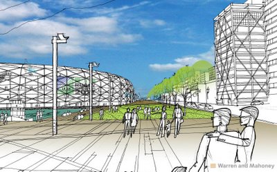
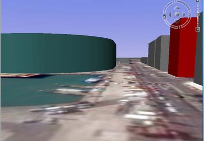
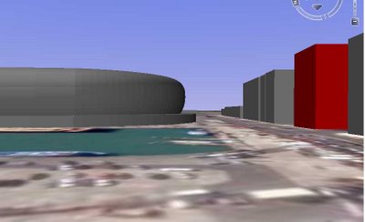
 Subsequent to discussions on the Stadium Drawings Deceptive thread, Den MT has sent me this comparision (above) generated from Warren and Mahoney's sketch drawings and with Union House as a datum -- the diagonally-braced building in the pictures -- which produced the drawing below, and a model from which the image above was derived.
 As a reminder, the interstorey height for Union House is 3.4m.
And Robin, who provided the original images shown here the other day, has his own post up showing his own mock-up at his own blog. As mentioned in his post he is using estimated dimensions "but I still think the true impact of this thing is being minimsed by the viewpoint & perspectives chosen and the true issue is: Do we need it at all?"
UPDATE 1: Here's another comparison, this time from the west, with the top view provided by architects Warren & Mahoney (which appears to show the stadium on Bledisloe Wharf), the bottom view from Robin's stadium model.

 UPDATE 2: Same comparison using Robin's new model, from a lower eye level (if you have Google Earth, you can download Robins's KMZ model at his site and play around to your heart's content with how the thing looks):
RELATED: Stadium, Politics-NZ, Auckland
6 comments:
With all due respect, I don't know that Robin's image can be fairly compared to the WAM one. The camera height in his image appears to be much higher than the 2m-odd eye-level shown in the WAM image (correct me if I'm wrong!) Look at the way the horizontal bracing members on the WAM Union House facade recede - the most 'horizontal' line obviously represents eye height - in this case it is clearly an observer standing at ground level.
This has the obvious effect of making the stadium appear 'larger' as, due to perspectival forcing, the eye-level is closer to the top of the stadium, meaning that the top of the Union House building seems closer to the stadium.
Furthermore, this is the early version of his stadium model which is a straight extrusion of the plan - clearly the WAM proposal is not a monolithic 'wall' as shown by this image. The curved glass perimeter goes a long way to mitigating the imposing effect of a 'wall' on the streetscape and is very important in how the stadium form is read in an urban context.
I don't want to seem like a stickler but you will have noticed that your post is getting linked from a lot of anti-waterfront folks and I think it is key that if apples are going to be compared with apples, they actually are apples.
I will do a quick re-render of my model at lunch to simulate the WAM image from eye-height to demonstrate my point and flick it through.
DenMT
Second para in above post - obviously I mean Robin's camera height makes stadium appear large.
DenMT
AL, I don't live in Auckland and have little familiarity with the waterfront area under discussion, as previously mentioned.
However the urban design aspects are a separate argument.
My concern is that aspersions have been cast both here and at Whaleoil, and further afield, that WAM might be being deliberately deceptive with their image compositing. Having done plenty of these kind of things (3D model composited into site photo) professionally, I took issue first with Whaleoil's bizarre assertions that WAM were misleading us due to the apparent height of some cranes in the foreground.
PC took it further by referencing the stadium to Union House, and pointing out that they did not match in perspective according to his elevation dimensions.
His assumed measurements were shown to be incorrect, and these wrong figures were further used in Robin Capper's model which was used to reinforce PCs tacit assertion that WAM are attempting to mislead the public.
Urban design is a very important consideration but not one I have sufficient information to debate right now. However I take issue with the various attempts to paint WAM as deliberately deceiving people as to the scale of the stadium.
It is one thing to use flattering angles, it is another to employ plainly wrong measurements to convince people of your view. That is what PC, Robin Capper etc appear to be currently doing.
DenMT
"...His assumed measurements were shown to be incorrect."
Ah, now let's be careful. I said at the outset that the figured dimension was to the top of the braced frame, which is exactly what it is.
And I think it's clear enough even from your own comparison image, Den, that the height for the stadium as composited by W&M are a little different from those in your model.
You seem to forget, when you say deception isn't possible, that this stadium is more about politics than it is about architecture or urban design. Always has been. And I'm sure we're all aware of the importance of deception to politicians.
And I think it's also very clear that the view looking east as given by W&M is just plain wrong, however you try and slice it.
I've reposted the kmz & images with Union at 47m high.
I didn't set out to match the WAM image as I don't think it represents what this structure will impose. I doubt many will see the stadium from a helicopter over the city or harbour yet the majority of the visuals are produced from these unnatural angles. GE tends to place the camera at about 8-11 m (also high) but even that greatly increases the apparent bulk and is closer to how most will see it from street or harbour.
The second curved model is more accurate and only it should be considered for comparison but at the time I did the first model I didnt have any section data to use.
Post a Comment