 A building tonight from a very different century, a house whose charms are perhaps a little difficult to discern from just a simple web page, particularly when seen with today's eye. The house is architect John Soane's own house, built in the London of 1812 -- the year in which Charles Dickens was born, Napoleon invaded Russia, Britain and the US were at war for the last time and Beethoven had just compsed his Seventh Symphony, and had just begun to go deaf. The difficulty here lies in three main areas.
The first two problems are somewhat obvious. For the casual observer it is easy to just dismiss this as some sort of everyday classical building. It isn't. It does use classical motifs, but by the standards of the day the skin is relatively unblemished, and the ornament is incredibly restrained, almost spare.
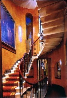
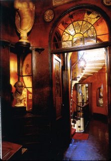 Soane was one of the few genuine English Romantic architects, and perhaps the only one to eschew ornamentation simply for the sake of ornamentaion, and to begin to develop his own method and form of stripped back detailing. He used classical motifs, but intelligently rather than slavishly.
He was perhaps the pre-eminent Architect of the Enlightenment -- using reason, ingenuity, the limited materials and technology of the day and what was known about the nature of architecture to develop a totally new conception of stylised space, with man at the centre.
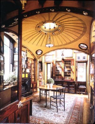
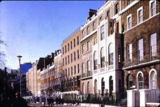
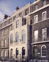
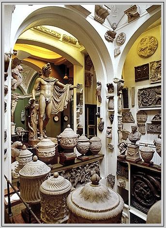 The second problem is that there's not much of the house that can really be seen from the garden square the building has to its front. Soane's house began life as a simple Georgian terrace house, in what was then the outskirts of Northern London, before being completely remodelled -- but all you see of that from the outside was what was seen at the time as a very sparely ornamented facade addition, the effect of which inside was to allow light to wash the inside of the street wall, and to help dissolve the spatial division between inside and out .
It is this spatial manipulation at which Soane excelled, and it is here we find both the real difficulty in trying to understand Soane's house only through a web page, but also the reason we should bother: Soane's house is a masterpiece of spatial manipulation, a landmark in architectural progress towards 'breaking the box' and moving to a more dynamic way of laying out space.
As a visitor you enter expecting to find the usual series of well-proportioned but spatially constrained rooms one has come to expect in a Georgian terrace house of this size; once inside however you realise you couldn't be more wrong.
 The place is like a tardis -- as one moves through the house space is always and everywhere unexpectedly opening up beyond. Soane has so cunningly manipulated space and the angles inside the house that the eye almost never seems to find real enclosure, and is constantly surprised to find that the enclosing elements either can't be seen, or have been made to disappearin some way, or to open out when we expect them to enclose.
The effect of all that manipulation is pretty hard to convey just through a few photographs, but to the visitor it is astonishing: one enters expecting a series of claustrophobic rooms, and instead finds oneself inside what seems to be almost never-ending space and with the feeling almost of being outside in a small, uniquely decorated park. Soane was breaking the containing box, the first architect to do this, and giving to the contained space a totally new sense of freedom appropriate to the Age of Enlightenment that this was.
You're left with the question: How does Soane do this? Let me give you two or three examples.
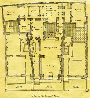
- Entering the house one comes first to a small lobby, but looks ahead to where the side wall of the house should be and find instead that the wall has disappeared and instead a light-filled oval stairwell (lit from above) fills space that really shouldn't exist. The oval walls that surround the stairs help to confuse the geometry of this space, and the fact that over time Soane bought the two neighbouring houses and used those in his remodeling to 'borrow space' help him to confuse the spatial boundaries of his own house. (You can see from the plan how the angled Hall wall and Breakfast Room wall help to confound the observer expecting the usual one-dimensional Georgian party wall.)
- Further on past the stairs and in this same extra space given up by the neighbouring house, Soane's Breakfast Room (the room above with the yellow 'handkerchief dome') sits beside an open window looking into the Monument Yard, and through that and a window-lined corridor beyond to a larger light-filled yard beyond that, take the eye out to a more disant view where one would least expect to, and from a space one hadn't expect to find.
The corners of the room itself have been removed (as you can see in the plan), destroying the 'gestalt' of enclosure, and the the dome itself is shaped to hover rather than enclose, and so positioned as to conceal from the seated breakfaster the upper enclosing corners of the space.
The effect in sum is to create the feeling in the occupant of a pavilion in a carefully planned and well-lit garden, a major achievement in a very small space in the midst of built-up Georgian London. - Enclosure. I mentioned it briefly above, but in a rectangular room our eye seeks enclosure at each of the four corners and the four edges of the ceiling. In many of Soane's room's the eys seeks but never finds: surfaces are brought forward or back to hide or confuse the place where the corner should be, and in some places mirrors are cunningly placed at those corners to make it impossible to see enclosure. Our eye is always looking beyond to find the end of the space, but never quite finding it, and the effect is to make these small spaces appear much, much larger than they actually are.
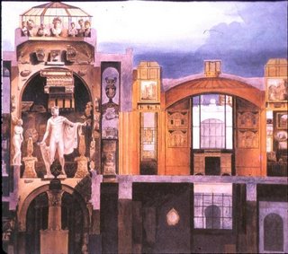
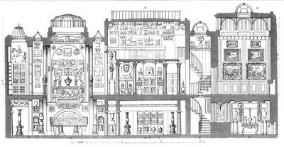
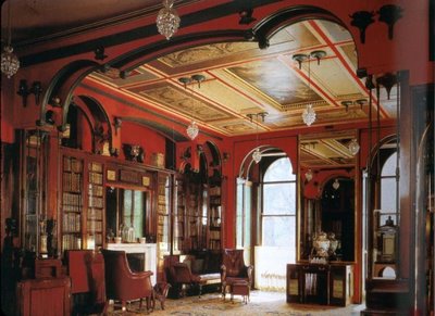 The effect of all these measures taken altogether in one house is dramatic, and that's not mentioning all his other effects and the other unexpected vistas or even his many ingenious technical innovations -- like the moving planes of his picture-frame mechanism (seen at the bottom of this post), and worth a whole post on its own) -- or venturing at all into the treasure garden that is the museum running the entire width of the three houses at the back, and in which Soane has just played and played and played some more with space and light and shape, and all the time with a twinkle in his eye (you can see a section through the museum just below.)
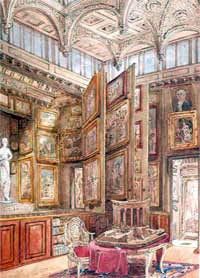
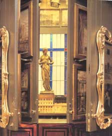 The architect has been enjoying himself, and this is a house designed to be enjoyed. It is a house designed to be in, and to celebrate the life of the occupant -- who was of course the architect himself.
It is my fourth favourite building, and she's a beauty.
RELATED: Architecture
1 comment:
Great to hear you enjoyed it so much, Brian.
Your report makes me envious to see it again.
Post a Comment