Open plan living is a vast improvement on life in a box -- or in a series of boxes, which is what describes most traditional houses, unfortunately.
But it’s not enough just to be “open plan.” The biggest open plan space is just a field, right? Good open-plan living still requires a delineation of spaces within the larger space – it’s just more difficult for the designer to ensure the right degree of separation between the sub-spaces, and the right amount of integration of each sub-space with the main space.
 In a well-designed open space, each space will have its own character, and will flow easily and comfortably into other spaces – especially if the spaces are successfully “nested.” It should feel natural, not forced, with each space retaining its own character within the larger space, but still being a part of it. Done properly, the “separation” or division of spaces gives the right feelings of liberation or enclosure appropriate to the space.
It’s important that the definition of each each space within the larger whole is done a subtle manner so as to avoid there simply being a space like 'one large barn.' Some popular methods of achieving this separation are:
- different floor coverings in different space;
- changes in floor level between spaces;
- furnishing layouts;
- the use of sliding or folding 'screens';
- the use of room proportions and wall returns to break up a larger space into smaller sub-spaces;
- posts and the like between spaces;
- changes in window and door layouts, e.g., a french door layout in one part of a space, and perhaps clerestory windows in the other;
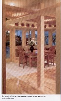
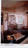
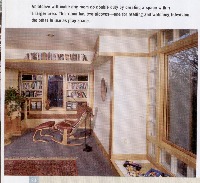
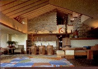
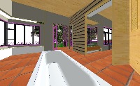
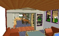
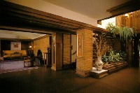
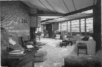
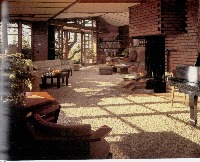
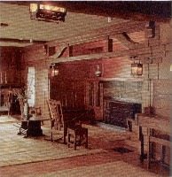
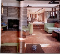
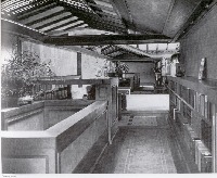
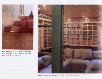
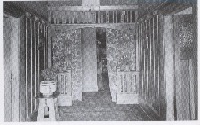
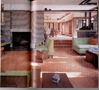
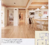
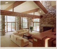
- changes in ceiling height, including the use of lowered ceilings and lowered ceiling decks, seen below:

The method by which the separation is achieved is usually dependent on the extent and quality of the spatial separation required.
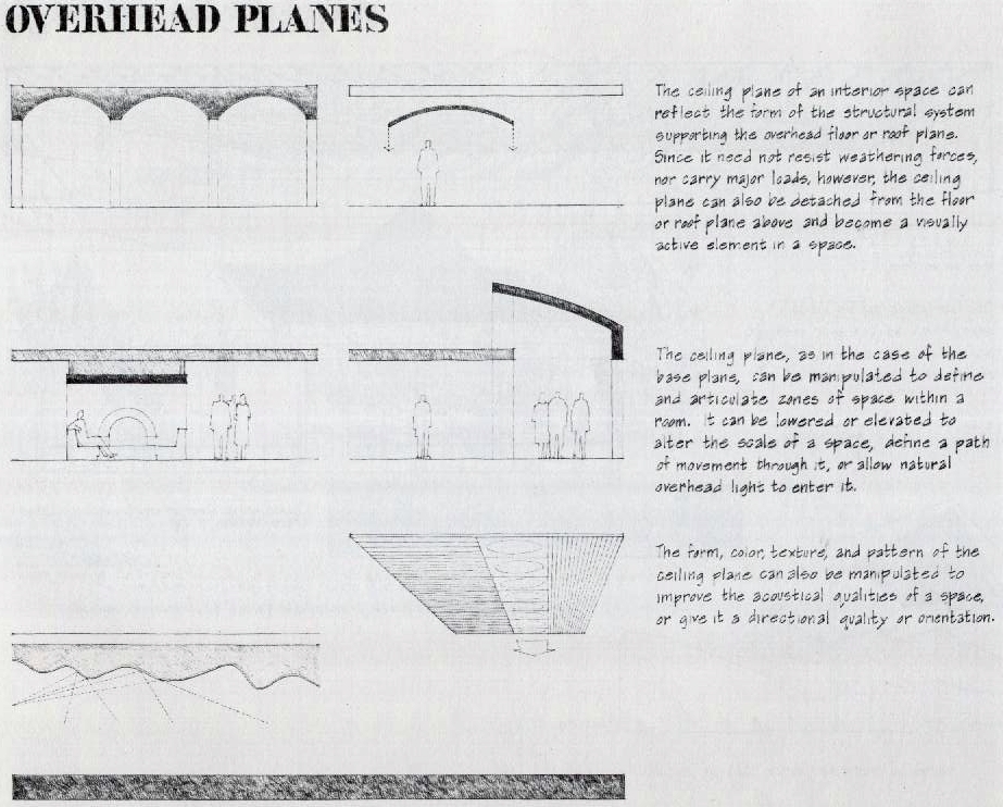 Which brings me to ceiling decks – a special kind of “overhead plane” - essentially a lowered “ceiling slab'” that you can see over, and in which you might have downlights, uplights and other services – and that the cunning designer can use to frame a space; to separate two spaces; to direct a view; to give order to a series of spaces; and another way by which to squeeze down the “space bubble” of occupants in a space to give either “containment” or “release.”
And oddly enough, if the “decks” are done well and they become the primary ordering element of a space – the means by which space in a building is “read” – then your walls, and other enclosures start to lose their importance. You’ve started to “break the box.”
Which maybe explains why you see them so rarely. Most modern designers like boxes. And they despise subtlety.
Ceiling decks offer a particularly subtle way both to 'frame a space' and to divide one space from another, but also – if you do them well -- lowered ceiling decks that 'frame' a space help to make that space and those around it appear larger than they are.
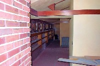
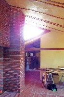
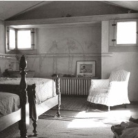
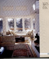
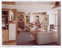
So basically, a lowered ceiling deck is simply a lowed or independent part of a ceiling, usually horizontal in the manner of an above-ground 'deck.' Below are some examples of lowered ceiling decks, ceiling dividers and “picture rails” (used to suggest a lowered ceiling) using different styles, and from different eras. See if you can see all that the designer as hoping to achieve with it:





2 comments:
This might be a bit of an injoke, but was I the only one who went through that list, and went through Ken's old place to see where I could find where Peter had designed each of the tricks he mentions?
And they *do* work well.
Thanks Eric. 'Preciate that. :-)
Post a Comment