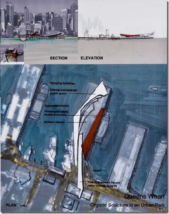
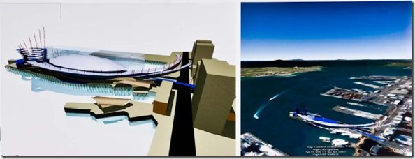
The big red gates were swung open today and Auckland’s Queens Wharf was opened to the public – for a few hours anyway, although by the speeches of the politicians holding the keys you’d have thought they were about to part the Red Sea for good.
This is the chosen site for Rugby World Cup’s Party Central, so it’s not just curiosity that sent people through those gates this afternoon: There were any number of Citroen owners out there too – i.e., architects keen to see how their designs for the ‘Party Central’ architectural competition stacked up on the site itself.
Queens Wharf up close and personal is vast and windswept, even on a sunny day like today, and the entries for the design competition to fill it for Rugby World Cup and beyond were also posted today, both online and ‘in person’ at the Union Fish Co building down on Quay St. One or two of these ideas are probably going to cost you a lot of money between now and 2011 -- and only a few look like they’re be able to make any of it back -- so you owe it to yourself (so to speak) to see where your money might be going. And even if ways can be found to make any of these pay for themselves, whatever’s built there is going to preside over Auckland’s harbour and be beamed out to the world during Rugby World Cup, 2011 – so you’d want it to be done right, wouldn‘t you.
Which is really my way of saying that you should take a look at what’s been designed for down there. Here’s the official website. Here’s the brief. Here’s the whole pageful of designs. Here’s your information about the exhibition of designs.
There are 233 designs produced from this short two-week competition – just enough time to get a strong idea, and almost enough time to present it well – in many of whom the words sails, sustainability, “elegant sheds” and “flax baskets” figure prominently, as do knock-offs of some of the world’s most well-known architects, along with wakas, silver ferns and rugby balls by the dozen. No surprises there. Other more rigorous and more original architectural themes are also evident, which you’d expect when Auckland’s best and brightest architects put their minds to the same site: a site whose situation is, lets face it, a stunner.
When it’s finished whatever’s built there will become, or should become, the way for Aucklanders in what’s now a shambles of a downtown to head out from the heart of their city and experience the Hauraki Gulf and one of the world’s best harbours. But it has some challenges:
- Even with the red fence removed it’s still not easy getting there over all the roads – and the new bus terminal at the foot of Queen St is more a barrier than a link
- The scale of the harbour itself is so vast (like Sydney’s only several times larger) and the population so small (like Sydney only several times smaller) that to make something work there is a real challenge.
- Windswept wastelands litter the world as a result of architectural competitions for public space, and this site and its context offers more opportunity than most for this to happen again.
- A bill for development that neither the government nor the two councils involved – or, I’ll wager, most of their ratepayers and taxpayers -- really wants to pick up. Which is why two sheds are supposed to be retained which are so unattractive that if they were on a back block in Piopio you’d probably knock them down – yet here they are in a prime spot about to have the world’s eyes on them, and all the talk is how to bodge up some way to ‘make them work.’
So how have the designers solved these problems and summed up the site? The brief was to put a Cruise Ship Terminal, Rugby World Cup ‘Party Central’ and a rigorous and lasting public space down there. Most of the better solutions have included at least a few of the following features:
- Good pedestrian links to Queen St and Quay St.
- Sheltered (and partially covered) amphitheatres as gathering spaces.
- ‘Look-outs’ at the end of the wharf to present the Hauraki Gulf to visitors, and to act as a ‘destination’ for pedestrians at wharf’s end.
- Offering the chance for dining over water – something strangely absent in what should be the world’s best maritime city.
- Use of podiums to remove the Cruise Ship services and parking away from public spaces.
And here’s what I spotted doing some of these things well. To see them properly click on the image and a PDF image of the one-page design submission should open up. As the designs are all submitted anonymously, they’re referred to only by numbers (disclaimer, one of these may or may not be my own contribution):


So those are the ones that caught my eye. And what will probably win? Probably none of these. Probably something like one of these two: something that’s simple and box-like and could just as easily be in a suburban park; something unchallenging that re-uses the two existing barns; something with open plazas so windswept and vast – so pedestrian and unimaginative – it’ll feel like Red Square by the Water; something without a hope of earning back its construction costs, so that you’d wonder whether it would even be worth the bother and the expense. Nice pictures but.
UPDATE: Clearly while all the architects were wandering around starry eyed on the wharf yesterday, the politicians were doing a deal. From Radio NZ comes news that "Government is not ruling out more Queen's Wharf cash" :
“The Government is now open to the idea of pumping additional money into the redevelopment of Queen's Wharf in Auckland. . . .
“The Government bought the wharf jointly with the Auckland Regional Council in June for $40 million and warned it did not want to spend any more on it.
However Prime Minister John Key now says the Government could contribute further.”
My guess is that John Banks showed John Key the amount the parlous ratepayer could afford, pointed to something like the sad picture above and said something like: “Unless your taxpayers pony up, that’s all you’re gonna get.” That’s just a guess, mind you. ;^)


8 comments:
Completely agree with you there. Some of the desings are too radical for the unimaginative politicians of Auckland. I am sure we will be left with some tacky Kiwiana theme that will be an embarrasement for our city. Not that arriving in Auckland to find a tarted up banana shed as the centerpiece of Auckland will be less underwhelming.
$80 million dollars for a cruise ship terminal is nothing if you want a "world class" public space...Maybe if you want to keep those vomituous sheds.
Good on you for submitting something - I didn't in the end. I've posted about why. I do agree with most of your thoughts on the issue, incl. the conservative design they will most likely choose. And it's an odd brief too - a one off event where the sheds must be retained and then a passenger terminal later, it's a multi-stage project the entries had to tackle on one sheet of A1.
I went down there today just after 3 and was reminded of what a blank slate it is. Those sheds are so bad. The views out the end are amazing, but that disgraceful 10 floor Hilton on Princes wharf obscures the Harbour Bridge and the view down the inner harbour - thank heavens the authorities seem to have excluded anything like that from this wharf development.
This is going to be another boondoggle. The end result will be similar to the Homebush Stadium in Sydney. That edifice to state theft and utter waste of people's money was built for the National Socialist Games of 2000. It's real cost is in the hunderds of millions and still the costs keep growing. There is never a halt to the hunger for cash to keep such monuments to collectivist stupidity intact. Far from becoming THE centre for people to gather in the geometric heart of the city, as was dishonestly promised during the initial cash-raid justification phase, its usual state is silent and abandoned, quietly generating big overheads and ever inflating losses. It's a momument to state consumption as are all of its ilk. On most days of the year you would be hard pressed to find more than a few dozen people on the site and most of them are maintenance crew... All it needs is some tumbleweed blowing by.
And something similar is what is going to be the end result of this latest misguided adventure. Being that this is in New Zealand it's going to differ in some asthetic aspects. It will be grotty from the git go and it will look cheap. It will have the special quality of public spaces throughout NZ, it'll get dirty and look unmaintained quite rapidly. That special smell...
Remind me why this idiocy is being foist upon us...oh, yes, that's right. It's for a game of pig-ball. Given that the site of the final is Pig Island that, at least, is appropriate.
LGM
Those sheds have to go. Opening the gates yesterday was an opportunity to appreciate their sorry condition. They are not worth keeping and they stand in the way of a successful design.
This Party Central fantasy is nonsense. We need to develop the space for the city, not for some sports contest that will be gone before you know it. The 2011 deadline is too close for comfort; we will wind up with a half cocked and half-completed design.
Thanks Tim.
Paul: Yep, I agree on both counts -- mostly.
I should above said above that some of the most successful architectural solutions seemed to recognise that it's the long-tern solution that's by far the most important, but that the work for RWC can be a good first stage in getting that done.
Which excludes, of course, the correct 'political solution' to the problem, which is of course to run a design-and-build competition for the wharf, and then sell it to the highest and best private bidder with a covenant to build what was designed.
I'm sure you'd agree. :-)
Surely all these proposals should be on 6m stilts to cope with rising sea levels?
Post a Comment