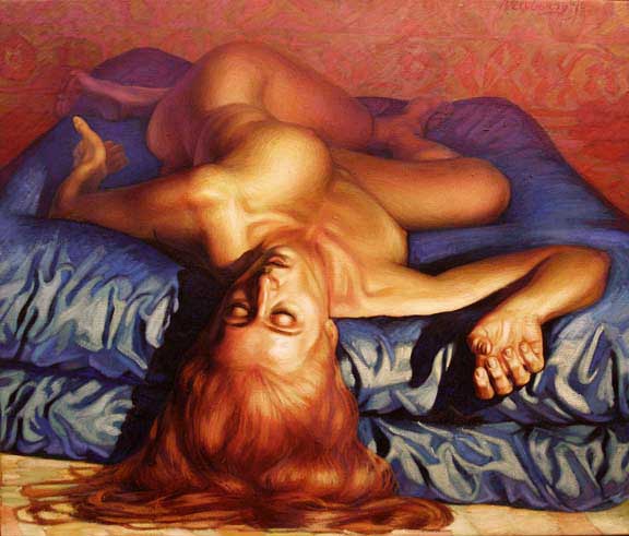
Here's another mini-tutorial from artist Michael Newberry, this time on the Integration of Colour, using as his 'model' his own painting Counterpose, from 1990 (above). He begins:
In the tutorial, Integration of Light, I mentioned that the theme of Counterpose is about a harmony of contrast. I showed how I painted extreme contrasts in light and dark. In this tutorial I am showing how, keeping to the theme of contrast, I painted extremes of color contrasts...Read on at this link. And enjoy the redhead.
LINK: Mini-tutorial. Integration, part 2: Colour - Michael Newberry
RELATED: Art
5 comments:
Well she certainly isn't ugly! Far fropm it. But I'm more interested in the beauty of the mind than the body.
Personally I won't read the article. Not because of a lack of interest. Rather because of the fact that my imagination doesn't work in a way that is very useful for drawing. I cannot visualise. I can create plots and fully detailed characters (I deliberatly use myself as a template for the hero ones) for stories easily, but not visualise. At all (unless it's sex related and even then the background is non-existant).
What a hideous painting!
The clashing colours are just disturbing and the woman's position on the bed is awkward. No sir, I don't like it.
Seconding Blair. The guy has obvious technical skill, and I do kind of like the composition, but the colours are ghastly. Goddamn.
I'll read the article to see what his take on colour actually is...
DenMT
Another excellent Newberry tutorial. Kudos for these informative lessons, explaining technical aspects for the layman. I've learned heaps from him. Cheers, MN!
I like the colours in his pic: bright, lurid and garish. Very 'Van Gogh'.
Shocking intense colours elicit powerful emotional responses. "Optical violence."
Turn up your colour & contrast monitor settings and let her rip!
Yours eye-catchingly,
Fauve fan (wearing budgie yellow pants, shocking pink shirt, and electric blue tie).
I, like Phil, actually like his choice of colours. I think they offer nice contrast and highlights. And he has good technical ability.
Post a Comment