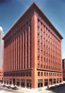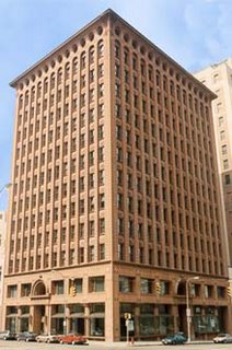
 Wainwright Building, St. Louis, Missouri, 1890-1891, Louis Sullivan (right) Guaranty Building, Buffalo, New York, 1894-1985 (left) Without Louis Henri Sullivan, the world's skylines would look very different. The tall building grew up on the American prairies with the invention by Otis of the elevator, and by Chicago engineers of the tall steel frame.
 The artistic problem was how to express this new thing. With no historical precedent on which to copy (most architects were no more original then than now) for years architects simply piled storey upon storey, Gothic upon Classical, cornice upon portico.
The results were ... dire. It was Frank Lloyd Wright's mentor Louis Sullivan who realised not just that this would not do, but that what was happening violated a fundamental law. Like everything in existence, a building should express its nature, he said. "What is the chief characteristic of the tall office building?" he asked. "It is lofty. ... It must be tall, every inch of it tall. ... It must be every inch a proud and soaring thing, rising in sheer exultation . . . from bottom to top . . . without a single dissenting line." Said Frank Lloyd Wright some years later:
When buildings first began to be tall, architects were confused – there were no precedents – they didn't know know HOW to make them tall. They would put one two or three storey building on top of another until they had enough.
.... I remember Leiber Meister [Sullivan] came in one afternoon and threw something on my table – it was a 'stretch' with the Wainwright Building in St. Louis designed in outline upon it. He said: “Wright, this thing is TALL. What's the matter with a tall building? Well, there it was, TALL!” After that the skyscraper began to flourish – TALL.
 With the Wainwright Building, a simple ten-storey speculative block, Sullivan had discovered how to express the tall building, and into the world was born a new thing.
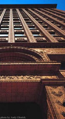
With the Guaranty Building four years later (right) he came to maturity in that expression: the verticals expressed, the horizontals recessed, the tripartite division, the efflorescence of ornament -- "just enough to allow the bones to show." From these two, for good or ill, all skyscrapers would derive. And with these buildings and his statement of the underlying principle of architectural design, Sullivan's place in history was complete.
Said Sullivan in 'The Tall Building Artistically Considered' : All things in nature had shapes, forms, and outward appearances "that tell us what they are, that distinguishes them . . . from each other." So too it should be in a building. Form, he said, should follow function.
And with that, two new things under the sun was born: a dictum that would ring through the ages, and that proud and soaring thing; the tall building.
LINKS: Louis Sullivan - What’s the Big Idea? - Peter Cresswell
Master of the skyscraper - David van Zanten
4 comments:
I appreciate these architectual and design vignettes. Keep it up.
And aren't they things of beauty? Didn't Sullivan design that wonderful bank building with the hal-oval windows too?
(can't find the pic in my collection, dammit)
aaah..got the link!
http://www.artificeimages.com/buildings/National_Farmers_Bank.html
Yes, beautiful isn't it. :-)
Post a Comment