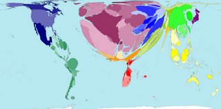
 A picture or a good map can be worth a thousand words -- with one look you can pick up the message, and greater study gives you even more information. No words are needed to tell the story of these maps of the world with portions either enhanced or minimised to reflect the figures used. [Hat tip Julian] This one on the left for instance showing Tourist Destinations explains why Western Europe is so packed with people over Summer, and why they say Ireland sinks six inches over Christmas. More useful maps here.
Another useful 'map' which I'm sure you've seen before and which these reminded me of if the composite picture of Earth's lights from space which perhaps tells more clearly than any other single image the difference between wealth and prosperity, and the lack of it. Make sure you click on the picture to enlarge on the bright lights of those countries embracing western values, and the many black holes elsewhere.

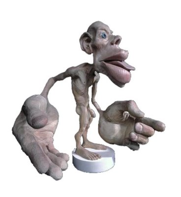
And other memory stirred of another similarly morphed picture in which a person's body parts are morphed to reflect the amount of the brain's space dedicated to controlling that part of the body. Here, at right, is The Sensory and Motor Homunculus:
LINKS: Worldmapper.Org - Social and Spatial Inequalities Research Group, University of Sheffield
Earthlights - Not PC
The Sensory and Motor Homunculus - Center for Nonverbal Studies
TAGS: Science, Economics, Multiculturalism
1 comment:
MAPS! Hooray, much better topic than medals. You don't mention the grand-daddy of hugely informative statistical maps - Charles Joseph Minard's map of the path taken, and losses suffered by, Napoleon's Army in Russia in 1812. Date and temperatures are overlays at the bottom.
Post a Comment