Here's a good one: an economic map that dramatically illustrates the size and market of the US relative to other countries by comparing states to countries of roughly similar income:
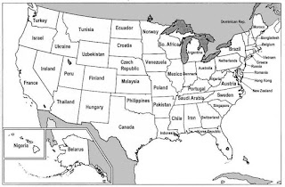 Click on the map to go to the larger map at the site, Strange Maps. You'll never guess which 'state' New Zealand matches.
Haha. We got DC!
ReplyDeleteDC. ha, how appropriate.
ReplyDeleteWhat a great map though!
Would also like to see a list comparing corporations to nations. That is also sobering.
Such shows how awfully parochial and straw brained all those US haters are.